In a growing number of states, you can add your ID to Apple Wallet. Here’s how to add them, how they work, where they are, what the limitations are, and what they can do.
We’re moving closer and closer to a world where you can ditch your physical wallet. You can already add your credit cards, debit cards, loyalty cards, tickets and boarding passes, and most recently — your driver’s license to Apple Wallet.
But the license rollout is not everywhere. This has increased the uncertainty on whether or not your ID can be added and if it can be, where it can be accepted.
This article was last updated on May 27, 2026.
How to add your ID to Apple Wallet
Adding your driver’s license to Apple Wallet is simple.
- Open the Wallet app on your iPhone
- Tap the + button in the top-right corner
- Tap Driver’s License and ID Cards
- Walk through the verification process
The verification process will include ways to ensure you are the same person who is adding the ID. You’ll have to scan the front and back of your ID as well as take a series of selfies to match your image on file with the department of motor vehicles in your state.
Apple also introduced a digital ID based on the U.S. passport in iOS 26. Functionally similar to the licenses, it can be used as a form of identification at TSA lines, but it’s not used as an actual passport. It provides a way to make the ID without the person needing a driving license.
The process is similar, except it uses your passport.
IDs can only be added to one phone at a time. If you are setting up a new device before wiping your old one, your ID may fail to add until the erase is complete and the servers catch up.
Which states support digital IDs
One of the bigger problems with digital IDs is where they are supported. As each digital ID is managed by the issuing state, every state has to implement its own program to support them.
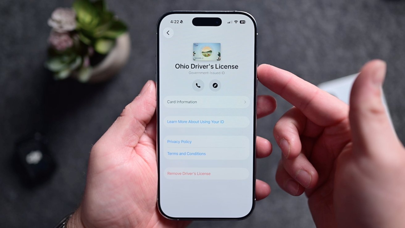
Ohio is one of 10 states and provinces that support digital IDs in Apple Wallet as of mid-2025
As of April 6, 2026, there are 14 states and territories that support Driver’s licenses in Apple Wallet.
- Arizona
- Arkansas
- California
- Colorado
- Georgia
- Hawaii
- Illinois
- Iowa
- Maryland
- Montana
- New Mexico
- North Dakota
- Ohio
- West Virginia
- Puerto Rico
Which states will soon support digital IDs
More and more states are adding support, though. Other states, like Utah, have pledged support but have not implemented it yet.
As for where those states planning to support digital IDs in Apple Wallet are, the list as of April 6, 2026, includes:
- Connecticut
- Kentucky
- Mississippi
- Oklahoma
- Utah
- Virginia
Timelines for the states have not been confirmed, but they have been announced as being on board with the program.
To keep up to date, keep an eye here at AppleInsider, the TSA site, or Apple’s official list.
How to use digital IDs in Apple Wallet
In an ideal world, a digital ID would be accepted in any place your physical ID is accepted. It’s not that simple.
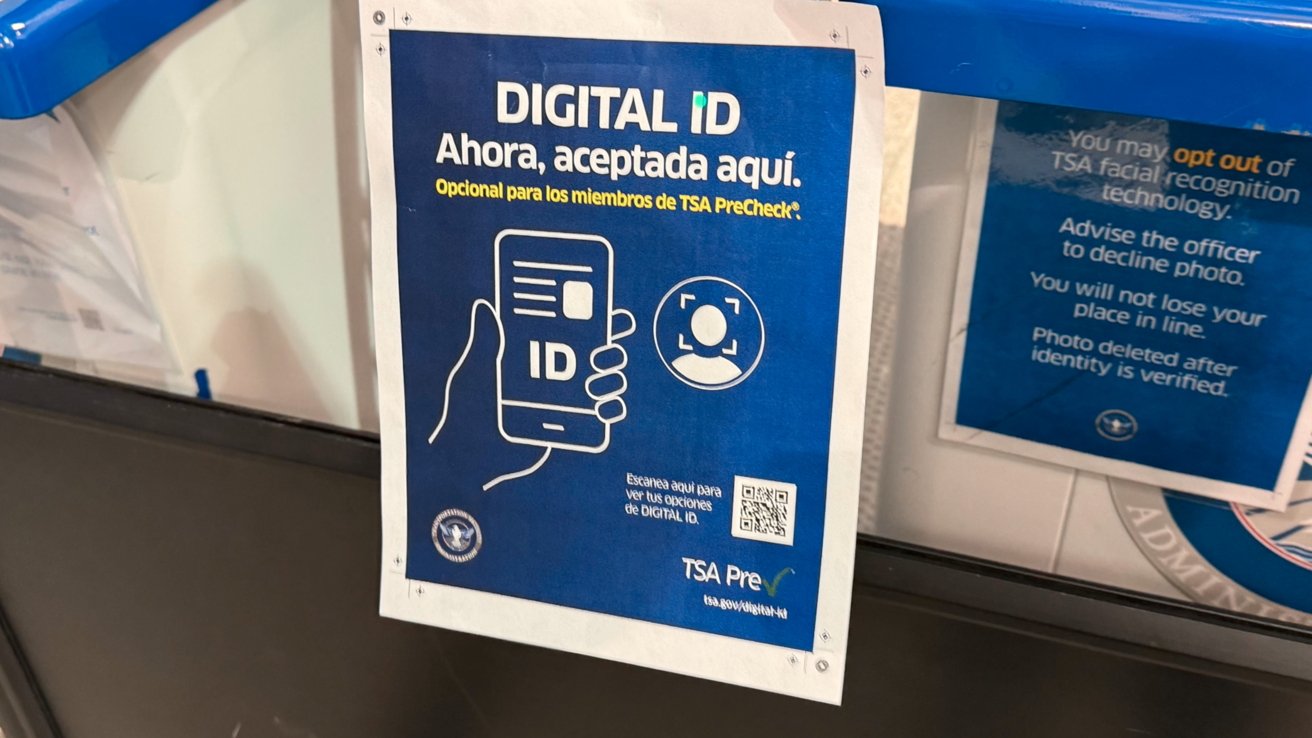
TSA is one of few that regularly supports digital IDs
The most common use for these digital licenses is in airports for TSA. Here in Ohio, we’ve tried it at all the major airports, including Columbus John Glenn International, CAK, and Cleveland Hopkins.
It’s so easy to walk through the TSA line, tap your phone to verify, and keep walking. Of course, if you fly to a state that doesn’t support digital IDs, you’ll still need your physical ID for the return trip.
Outside of airports, there’s not much else you can use it for. Places like bars, liquor stores, doctor’s offices, don’t accept it. There are just a handful of police districts that do, so even if you live in a state that it’s supported, you still need to carry your ID card around.
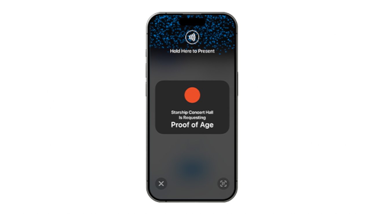
The free ID verification app can be used in Ohio to check digital IDs, like the age at a concert venue
The Ohio BMV offers a free iOS verification app that businesses can sign up for and use to verify any identities with a tap.
That sounds ideal, but in our experience, it is very limited. We’ve found only one business that had the app to verify our age.
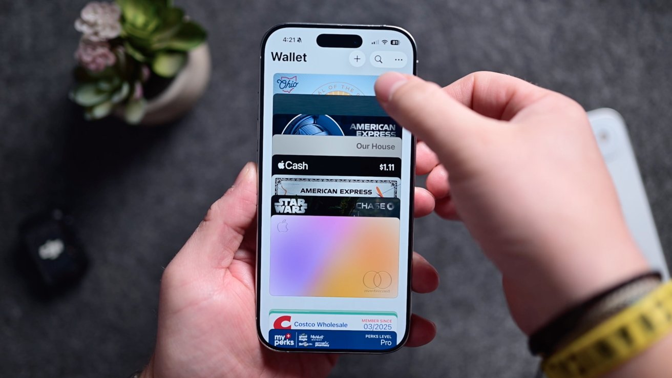
Some of the different cards being stored in the Wallet app
Most retailers still requested our physical card to scan the code on the back or swipe it into their legacy point of sale system. That makes it difficult and still necessary to carry around your physical license.
Using digital IDs in apps
Of course, there are other uses for digital IDs rather than just in the physical world. Your ID can also be used in apps.
Apps that support Apple Wallet ID can similarly verify things like your age or identity. Apple says Clear, MyChart, UberEats, and others will be adding support, though it doesn’t look like any of them have as of August 8, 2025.
It’s all about privacy
One of the best parts of digital IDs is the privacy. You only share very limited information.
When you give someone your actual ID, they have all of that info displayed there. With a digital ID, you are only sharing what you are required to share.
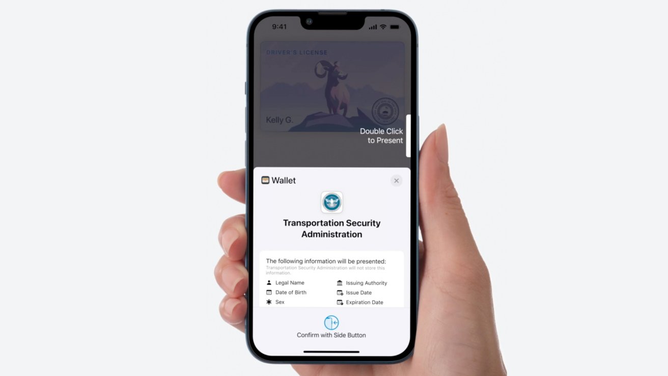
You explicitly get shown information to be shared, before it is transmitted
How it works is that when your ID is requested by either a tap or an app, a card appears with the information that needs to be shared. Before you approve the request, the iPhone will explicitly list what’s being asked for, before you accept the request.
Some may only need your name, while others may only need to request your age. That data is then encrypted, transmitted, and never stored.
Digital IDs may not appeal to everyone, but adoption has started to increase. Hopefully, we’ll see more states, police departments, apps, and businesses start supporting it as more states and users add it too.
Update November 18, 2025: Added Illinois to the list of supported states
Update April 6, 2026: Added Arkansas, Connecticut, Kentucky, Mississippi, Oklahoma, Utah, and Virginia to the coming-soon list.
Update May 27, 2026: Moved Arkansas from coming-soon to the list of supported states