Lost in Play is a game created by and for people who love to play make-believe.
The 2024 Apple Design Award (ADA) winner for Innovation is a point-and-click adventure that follows two young siblings, Toto and Gal, through a beautifully animated world of forbidden forests, dark caverns, friendly frogs, and mischievous gnomes. To advance through the game’s story, players complete fun mini-games and puzzles, all of which feel like a Saturday morning cartoon: Before the journey is out, the pair will fetch a sword from a stone, visit a goblin village, soar over the sea on an enormous bird, and navigate the real-world challenges of sibling rivalry. They will also order several pizzas.
ADA FACT SHEET
Lost in Play
- Winner: Innovation
- Team: Happy Juice Games, Israel
- Available on: iPhone, iPad
- Team size: 7
- Previous accolades: iPad Game of the Year (2023)
Lost in Play is the brainchild of Happy Juice Games, a small Israel-based team whose three cofounders drew inspiration from their own childhoods — and their own families. “We’ve all watched our kids get totally immersed playing make-believe games,” says Happy Juice’s Yuval Markovich. “We wanted to recreate that feeling. And we came up with the idea of kids getting lost, partly in their imaginations, and partly in real life.”
The team was well-equipped for the job. Happy Juice cofounders Markovich, Oren Rubin, and Alon Simon, all have backgrounds in TV and film animation, and knew what they wanted a playful, funny adventure even before drawing their first sketch. “As adults, we can forget how to enjoy simple things like that,” says Simon, “so we set out to make a game about imagination, full of crazy creatures and colorful places.”
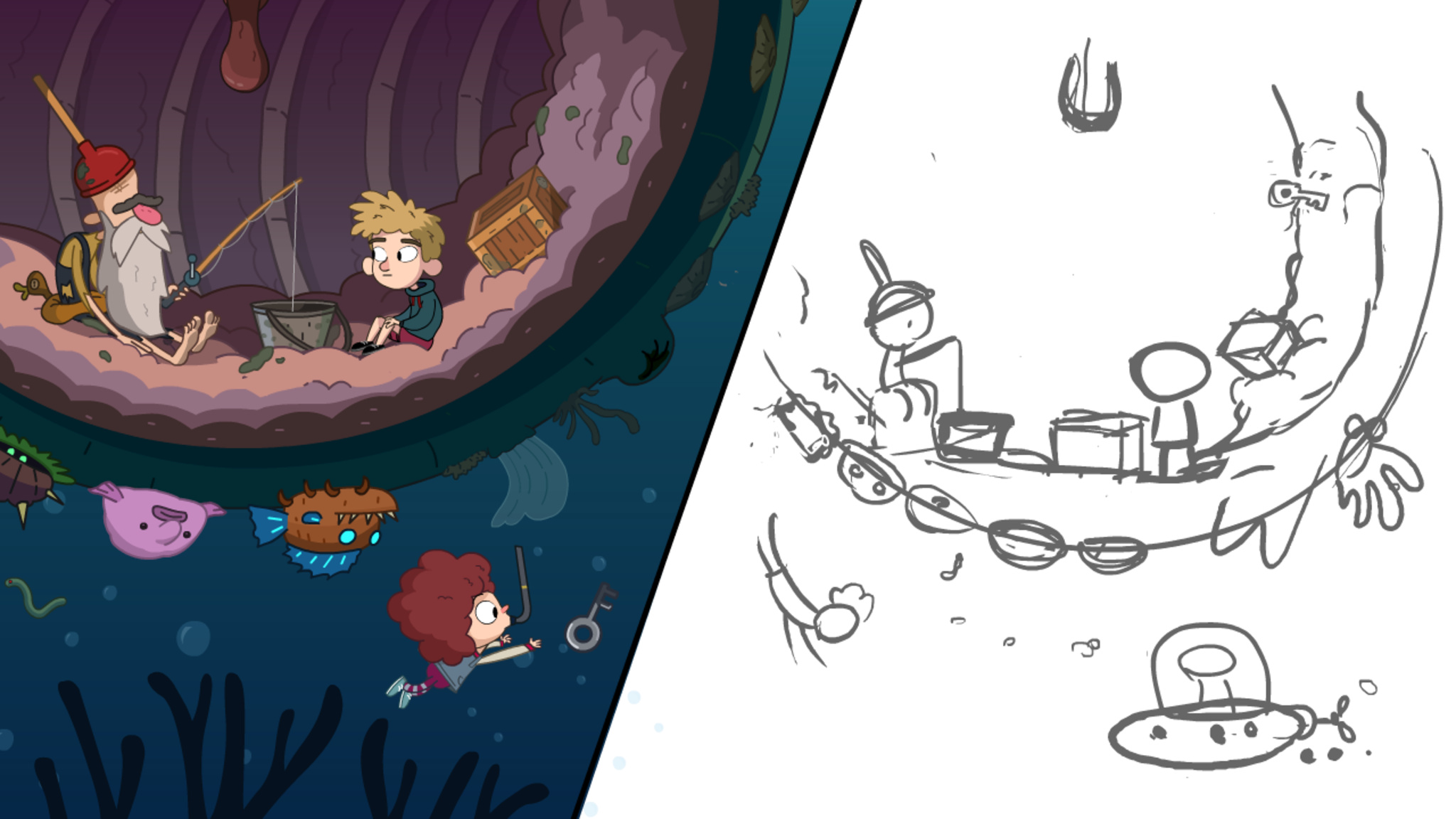
Toto meets a new friend in the belly of a whale in Lost in Play. At right is an early sketch of the scene.
For his part, Markovich didn’t just have a history in gaming; he taught himself English by playing text-based adventure games in the ‘80s. “You played those games by typing ‘go north’ or ‘look around,’ so every time I had to do something, I’d open the dictionary to figure out how to say it,” he laughs. “At some point I realized, ‘Oh wait, I know this language.’”
The story became a matter of, ‘OK, a goblin village sounds fun — how do we get there?’
Yuval Markovich, Happy Juice Games cofounder
But those games could be frustrating, as anyone who ever tried to “leave house” or “get ye flask” can attest. Lost in Play was conceived from day one to be light and navigable. “We wanted to keep it comic, funny, and easy,” says Rubin. “That’s what we had in mind from the very beginning.”
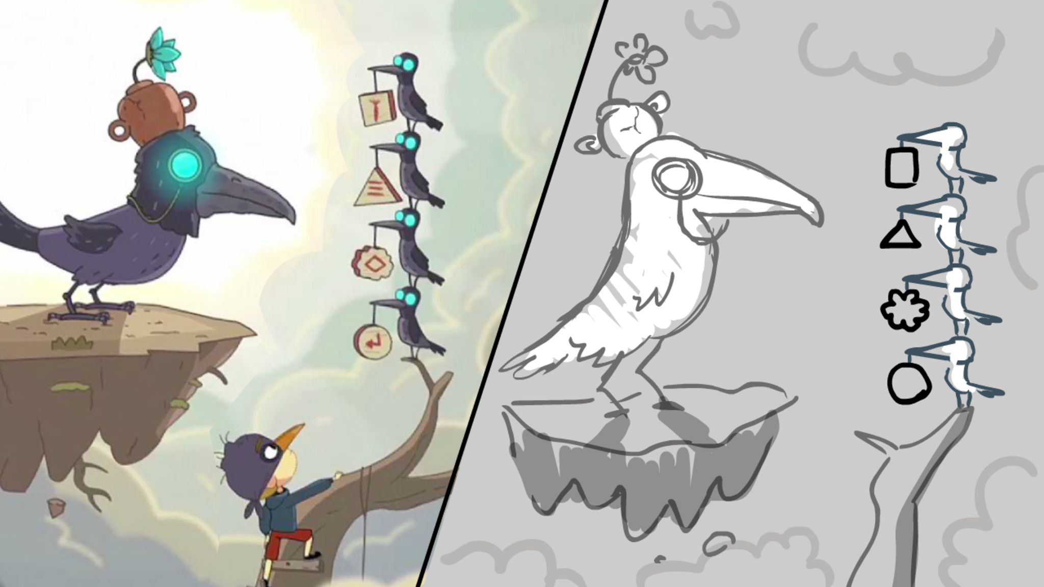
Toto must go out on a limb to solve the ravens’ puzzle in this screenshot and early sketch.
Lost in Play may be a linear experience — it feels closer to playing a movie than a sandbox game — but it’s hardly simple. As befitting a playable dream, its story feels a little unmoored, like it’s being made up on the fly. That’s because the team started with art, characters, and environments, and then went back to add a hero’s journey to the elements.
“We knew we’d have a dream in the beginning that introduced a few characters. We knew we’d end up back at the house. And we knew we wanted one scene under the sea, and another in a maker space, and so on,” says Markovich. “The story became a matter of, ‘OK, a goblin village sounds fun — how do we get there?’”
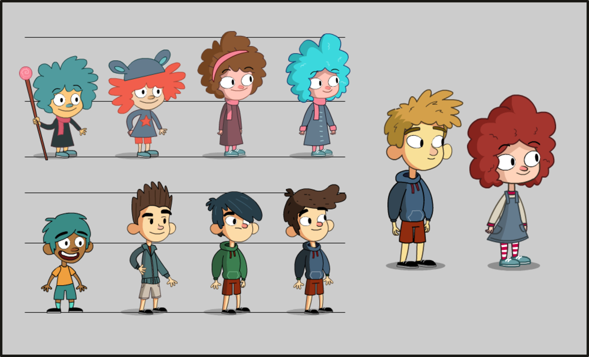
Early concept sketches show the character design evolution of Toto and Gal.
Naturally, the team drew on their shared backgrounds in animation to shape the game all throughout its three-year development process — and not just in terms of art. Like a lot of cartoons, Lost in Play has no dialogue, both to increase accessibility and to enhance the story’s illusion. Characters speak in a silly gibberish. And there are little cartoon-inspired tricks throughout; for instance, the camera shakes when something is scary. “When you study animation, you also study script writing, cinematography, acting, and everything else,” Markovich says. “I think that’s why I like making games so much: They have everything.”
The best thing we hear is that it’s a game parents enjoy playing with their kids.
Oren Rubin, Happy Juice games cofounder
And in a clever acknowledgment of the realities of childhood, brief story beats return Toto and Gal to the real world to navigate practical issues like sibling rivalries. That’s on purpose: Simon says early versions of the game were maybe a little too cute. “Early on, we had the kids sleeping neatly in their beds,” says Simon. “But we decided that wasn’t realistic. We added a bit more of them picking on each other, and a conflict in the middle of the game.” Still, Markovich says that even the real-world interludes keep one foot in the imaginary world. “They may go through a park where an old lady is feeding pigeons, but then they walk left and there’s a goblin in a swamp,” he laughs.
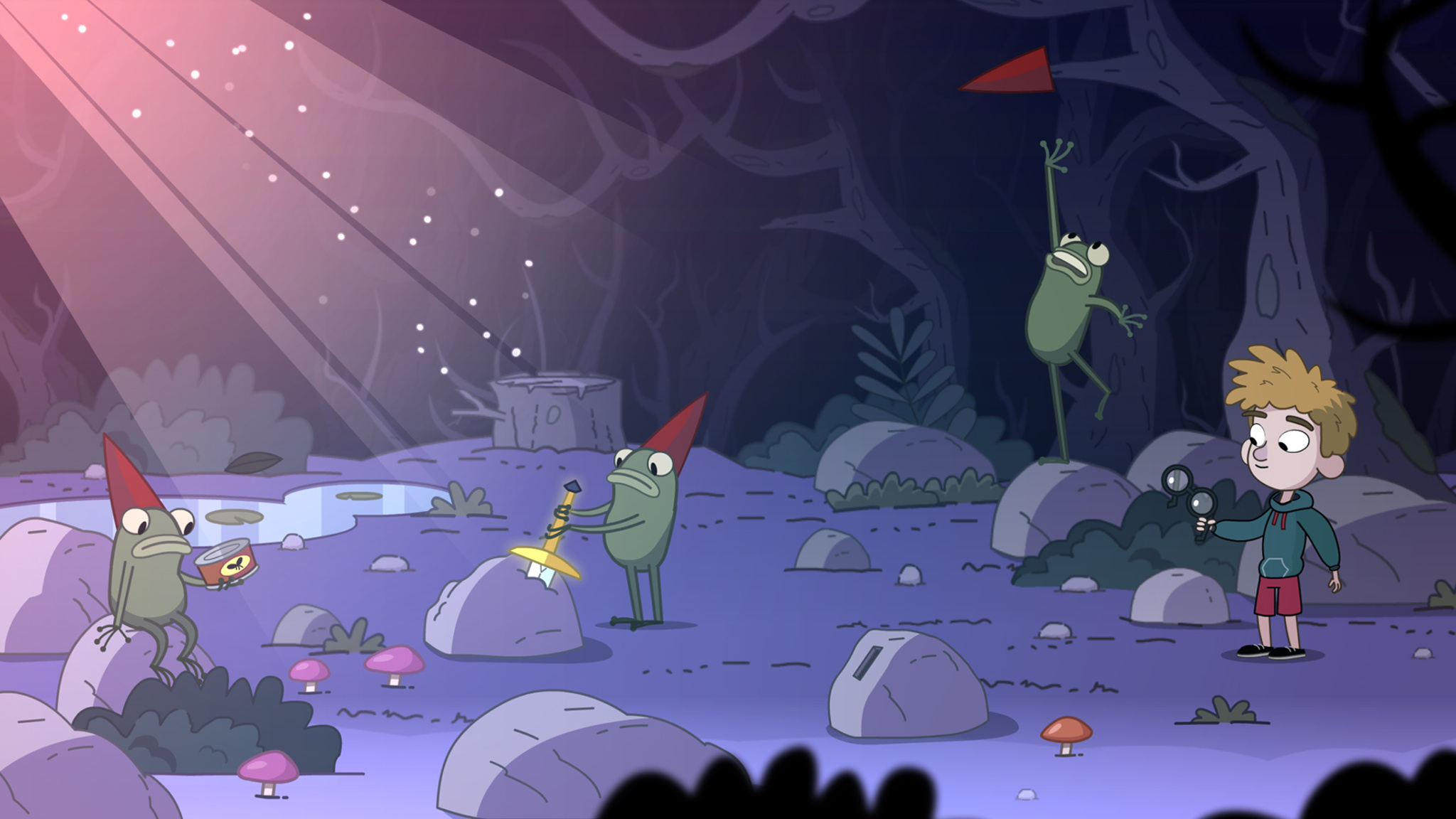
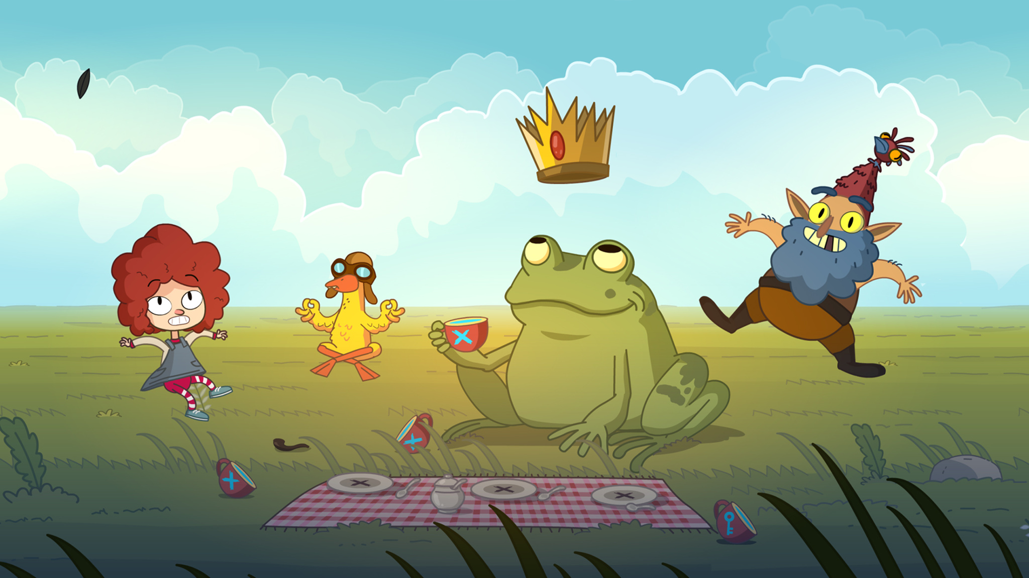
Strange frogs distributing swords are the basis for one of Lost in Play‘s many inventive puzzles.
On the puzzle side, Lost in Play’s mini-games are designed to strike the right level of challenging. The team is especially proud of the game’s system of hints, which often present challenges in themselves. “We didn’t want people getting trapped like I did in those old adventure games,” laughs Markovich. “I loved those, but you could get stuck for months. And we didn’t want people going online to find answers either.” The answer: A hint system that doesn’t just hand over the answer but gives players a feeling of accomplishment, an incentive to go back for more.
It all adds up to a unique experience for players of all ages — and that’s by design too. “The best feedback we get is that it’s suitable for all audiences,” says Rubin, “and the best thing we hear is that it’s a game parents enjoy playing with their kids.”
Meet the 2024 Apple Design Award winners
Behind the Design is a series that explores design practices and philosophies from finalists and winners of the Apple Design Awards. In each story, we go behind the screens with the developers and designers of these award-winning apps and games to discover how they brought their remarkable creations to life.