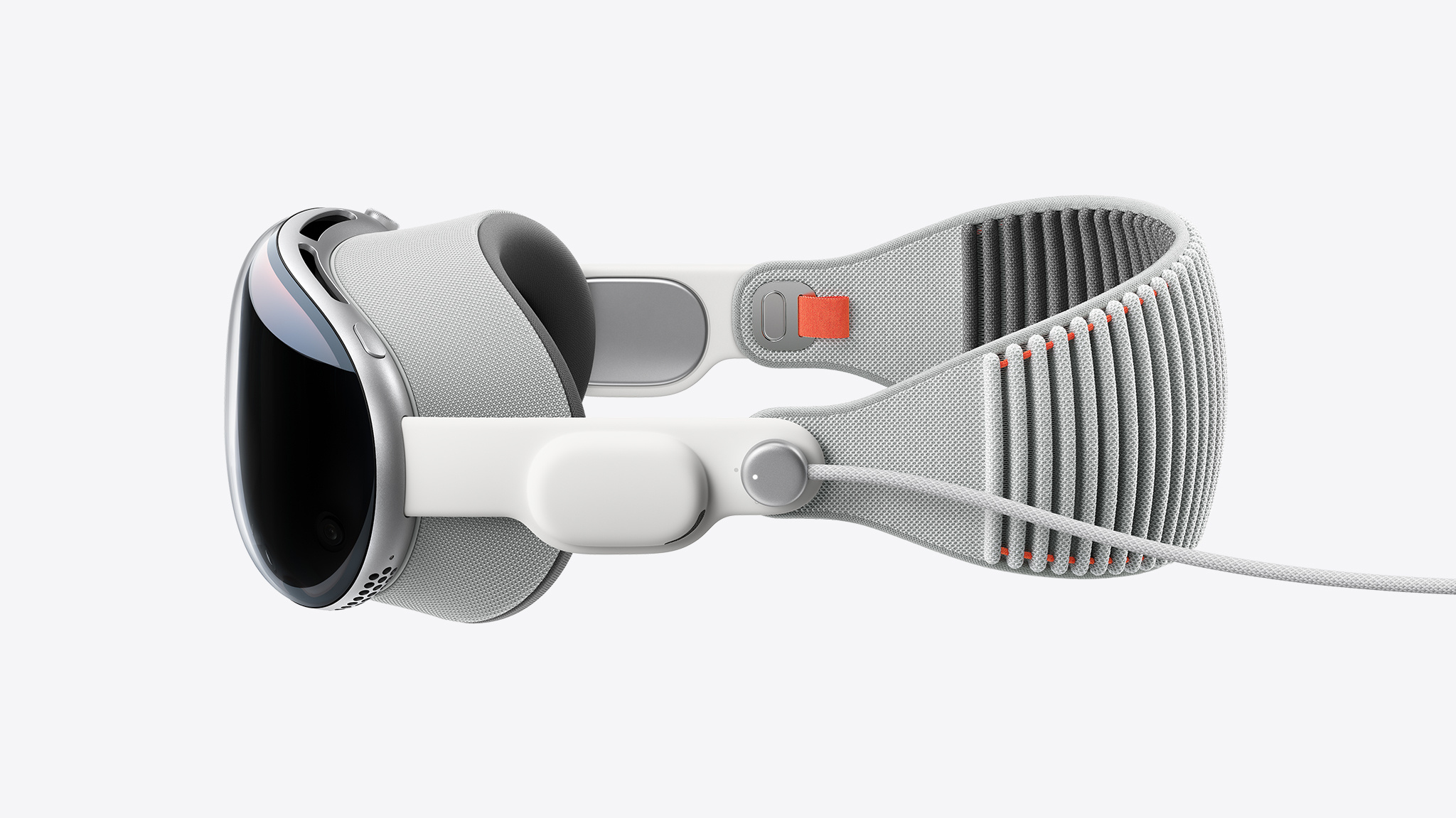
With the visionOS SDK, developers worldwide can begin designing, building, and testing apps for Apple Vision Pro.
For Ryan McLeod, creator of iOS puzzle game Blackbox, the SDK brought both excitement and a little nervousness. “I didn’t expect I’d ever make apps for a platform like this — I’d never even worked in 3D!” he says. “But once you open Xcode you’re like: Right. This is just Xcode. There are a lot of new things to learn, of course, but the stuff I came in knowing, the frameworks — there’s very little change. A few tweaks and all that stuff just works.”
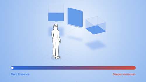
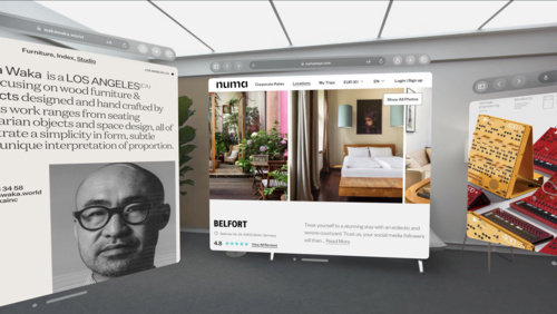
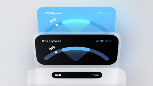
visionOS is designed to help you create spatial computing apps and offers many of the same frameworks found on other Apple platforms, including SwiftUI, UIKit, RealityKit, and ARKit. As a result, most developers with an iPadOS or iOS app can start working with the platform immediately by adding the visionOS destination to their existing project.
“It was great to be able to use the same familiar tools and frameworks that we have been using for the past decade developing for iOS, iPadOS, macOS, and watchOS,” says Karim Morsy, CEO and co-founder of Algoriddim. “It allowed us to get our existing iPad UI for djay running within hours.”
Even for developers brand new to Apple platforms, the onboarding experience was similarly smooth. “This was my first time using a Mac to work,” says Xavi H. Oromí, chief engineering officer at XRHealth. “At the beginning, of course, a new tool like Xcode takes time to learn. But after a few days of getting used to it, I didn’t miss anything from other tools I’d used in the past.”
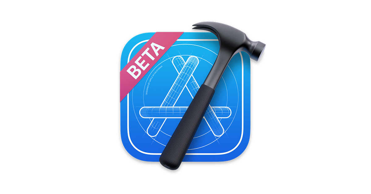
In addition to support for visionOS, the Xcode 15 beta also provides Xcode Previews for visionOS and a brand new Simulator, so that people can start exploring their ideas immediately. “Transitioning between ideas, using the Simulator to test them, it was totally organic,” says Oromí. “It’s a great tool for prototyping.”
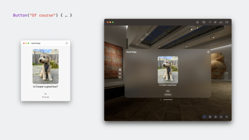
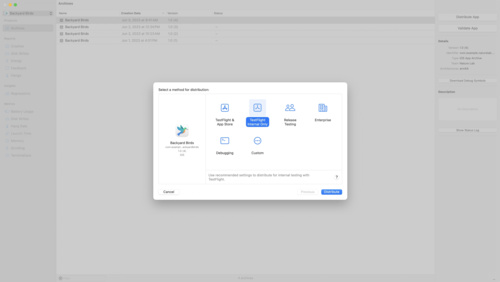
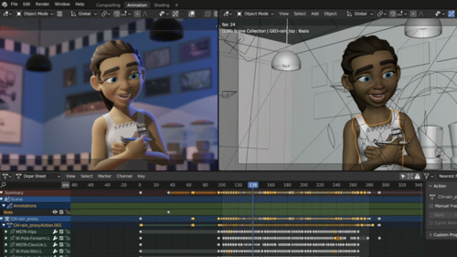
In the visionOS simulator, developers can preview apps and interactions on Vision Pro. This includes running existing iPad and iPhone apps as well as projects that target the visionOS SDK. To simulate eye movement while in an app, you can use your cursor to focus an element, and a click to indicate a tap gesture. In addition to testing appearance and interactions, you can also explore how apps perform in different background and lighting scenarios using Simulated Scenes. “It worked out of the box,” says Zac Duff, CEO and co-founder of JigSpace. “You could trust what you were seeing in there was representative of what what you would see on device.”
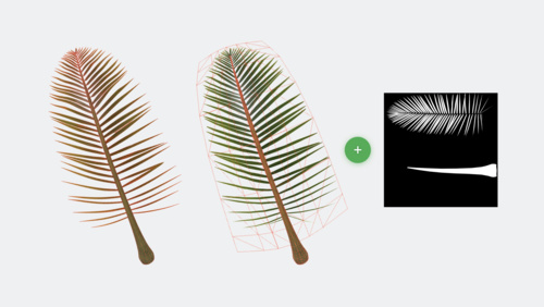
The SDK also includes a new development tool — Reality Composer Pro — which lets you preview and prepare 3D content for your visionOS apps and games. You can import and organize assets, add materials and particle effects, and bring them right back into Xcode with thanks to tight build integration. “Being able to quickly test things in Reality Composer Pro and then get it up and running in the simulator meant that we were iterating quickly,” says Duff. “The feedback loop for developing was just really, really short.”
McLeod had little experience with 3D modeling and shaders prior to developing for visionOS, but breaking Blackbox out of its window required thinking in a new dimension. To get started, McLeod used Reality Composer Pro to develop the almost-ethereal 3D bubbles that make up Blackbox’s main puzzle screen. “You can take a basic shape like a sphere and give it a good shader and make sure that it’s moving in a believable way,” says McLeod. “That goes incredibly far.”
The visionOS SDK also brings new Instruments like RealityKit Trace to developers to help them optimize the performance of their spatial computing apps. As a newcomer to using RealityKit in his apps, McLeod notes that he was “really timid” with the rendering system at first. “Anything that’s running every single frame, you’re thinking, ‘I can’t be checking this, and animating that, and spawning things. I’m going to have performance issues!’” he laughs. “I was pretty amazed at what the system could handle. But I definitely still have performance gains to be made.”
For developers like Caelin Jackson-King, an iOS software engineer for Splunk’s augmented reality team, the SDK also prompted great team discussions about updating their existing codebase. “It was a really good opportunity to redesign and refactor our app from the bottom up to have a much cleaner architecture that supported both iOS and visionOS,” says Jackson-King.
The JigSpace team had similar discussions as they brought more RealityKit and SwiftUI into their visionOS experience. “Once we got comfortable with the system, it was like a paradigm shift,” says Duff. “Rather than going, ‘OK, how do we do this thing?’, we could be more like, ‘What do we want to do next?’ Because we now have command of the tools.”
You can explore those tools now on developer.apple.com along with extensive technical documentation and sample code, design kits and tools for visionOS, and updates to the Human Interface Guidelines.
Download the visionOS SDK
Learn more about developing for visionOS
Prepare your apps for visionOS
Explore sessions about visionOS