As CEO of Flexibits, the team behind successful apps like Fantastical and Cardhop, Michael Simmons has spent more than a decade minding every last facet of his team’s work. But when he brought Fantastical to the Apple Vision Pro labs in Cupertino this summer and experienced it for the first time on the device, he felt something he wasn’t expecting.
“It was like seeing Fantastical for the first time,” he says. “It felt like I was part of the app.”
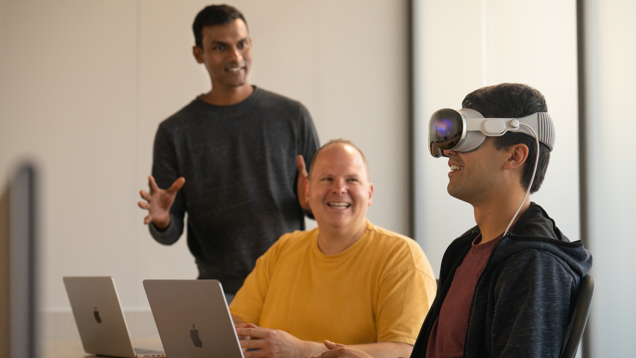
That sentiment has been echoed by developers around the world. Since debuting in early August, the Apple Vision Pro labs have hosted developers and designers like Simmons in London, Munich, Shanghai, Singapore, Tokyo, and Cupertino. During the day-long lab appointment, people can test their apps, get hands-on experience, and work with Apple experts to get their questions answered. Developers can apply to attend if they have a visionOS app in active development or an existing iPadOS or iOS app they’d like to test on Apple Vision Pro.
Learn more about Apple Vision Pro developer labs
For his part, Simmons saw Fantastical work right out of the box. He describes the labs as “a proving ground” for future explorations and a chance to push software beyond its current bounds. “A bordered screen can be limiting. Sure, you can scroll, or have multiple monitors, but generally speaking, you’re limited to the edges,” he says. “Experiencing spatial computing not only validated the designs we’d been thinking about — it helped us start thinking not just about left to right or up and down, but beyond borders at all.”
And as not just CEO but the lead product designer (and the guy who “still comes up with all these crazy ideas”), he came away from the labs with a fresh batch of spatial thoughts. “Can people look at a whole week spatially? Can people compare their current day to the following week? If a day is less busy, can people make that day wider? And then, what if like you have the whole week wrap around you in 360 degrees?” he says. “I could probably — not kidding — talk for two hours about this.”
‘The audible gasp’
David Smith is a prolific developer, prominent podcaster, and self-described planner. Shortly before his inaugural visit to the Apple Vision Pro developer labs in London, Smith prepared all the necessary items for his day: a MacBook, Xcode project, and checklist (on paper!) of what he hoped to accomplish.
All that planning paid off. During his time with Apple Vision Pro, “I checked everything off my list,” Smith says. “From there, I just pretended I was at home developing the next feature.”
I just pretended I was at home developing the next feature.
David Smith, developer and podcaster
Smith began working on a version of his app Widgetsmith for spatial computing almost immediately after the release of the visionOS SDK. Though the visionOS simulator provides a solid foundation to help developers test an experience, the labs offer a unique opportunity for a full day of hands-on time with Apple Vision Pro before its public release. “I’d been staring at this thing in the simulator for weeks and getting a general sense of how it works, but that was in a box,” Smith says. “The first time you see your own app running for real, that’s when you get the audible gasp.”
Smith wanted to start working on the device as soon as possible, so he could get “the full experience” and begin refining his app. “I could say, ‘Oh, that didn’t work? Why didn’t it work?’ Those are questions you can only truly answer on-device.” Now, he has plenty more plans to make — as evidenced by his paper checklist, which he holds up and flips over, laughing. “It’s on this side now.”
‘We understand where to go’
When it came to testing Pixite’s video creator and editor Spool, chief experience officer Ben Guerrette made exploring interactions a priority. “What’s different about our editor is that you’re tapping videos to the beat,” he says. “Spool is great on touchscreens because you have the instrument in front of you, but with Apple Vision Pro you’re looking at the UI you’re selecting — and in our case, that means watching the video while tapping the UI.”
The team spent time in the lab exploring different interaction patterns to address this core challenge. “At first, we didn’t know if it would work in our app,” Guerrette says. “But now we understand where to go. That kind of learning experience is incredibly valuable: It gives us the chance to say, ‘OK, now we understand what we’re working with, what the interaction is, and how we can make a stronger connection.’”
Chris Delbuck, principal design technologist at Slack, had intended to test the company’s iPadOS version of their app on Apple Vision Pro. As he spent time with the device, however, “it instantly got me thinking about how 3D offerings and visuals could come forward in our experiences,” he says. “I wouldn’t have been able to do that without having the device in hand.”
‘That will help us make better apps’
As lab participants like Smith continue their development at home, they’ve brought back lessons and learnings from their time with Apple Vision Pro. “It’s not necessarily that I solved all the problems — but I solved enough to have a sense of the kinds of solutions I’d likely need,” Smith says. “Now there’s a step change in my ability to develop in the simulator, write quality code, and design good user experiences.”
I’ve truly seen how to start building for the boundless canvas.
Michael Simmons, Flexibits CEO
Simmons says that the labs offered not just a playground, but a way to shape and streamline his team’s thinking about what a spatial experience could truly be. “With Apple Vision Pro and spatial computing, I’ve truly seen how to start building for the boundless canvas — how to stop thinking about what fits on a screen,” he says. “And that will help us make better apps.”