Day 3 at WWDC25 is all about the new design across Apple platforms. Sign up for group labs and check out video sessions about how to bring the new design to your apps and games.
|
|||||||||||||||||||||||||||||||||||||||||||||||||||||||||||||||||||||||||||||||||||||
Apple Developer News and Updates feed provided by Apple, Inc.
Day 3 at WWDC25 is all about the new design across Apple platforms. Sign up for group labs and check out video sessions about how to bring the new design to your apps and games.
|
|||||||||||||||||||||||||||||||||||||||||||||||||||||||||||||||||||||||||||||||||||||

Welcome to Day 2 at WWDC25! Watch the Platforms State of the Union recap, sign up for group labs, and explore video sessions.
|
||||||||||||||||||||||||||||||||||||||||||||||||||||||||||||||||||||

WWDC is here! Watch a quick video to help you get started, then dive into sessions and get ready for tomorrow’s group labs.
|
|||||||||||||||||||||||||||||||||||||||||||||||||||||||||||||||
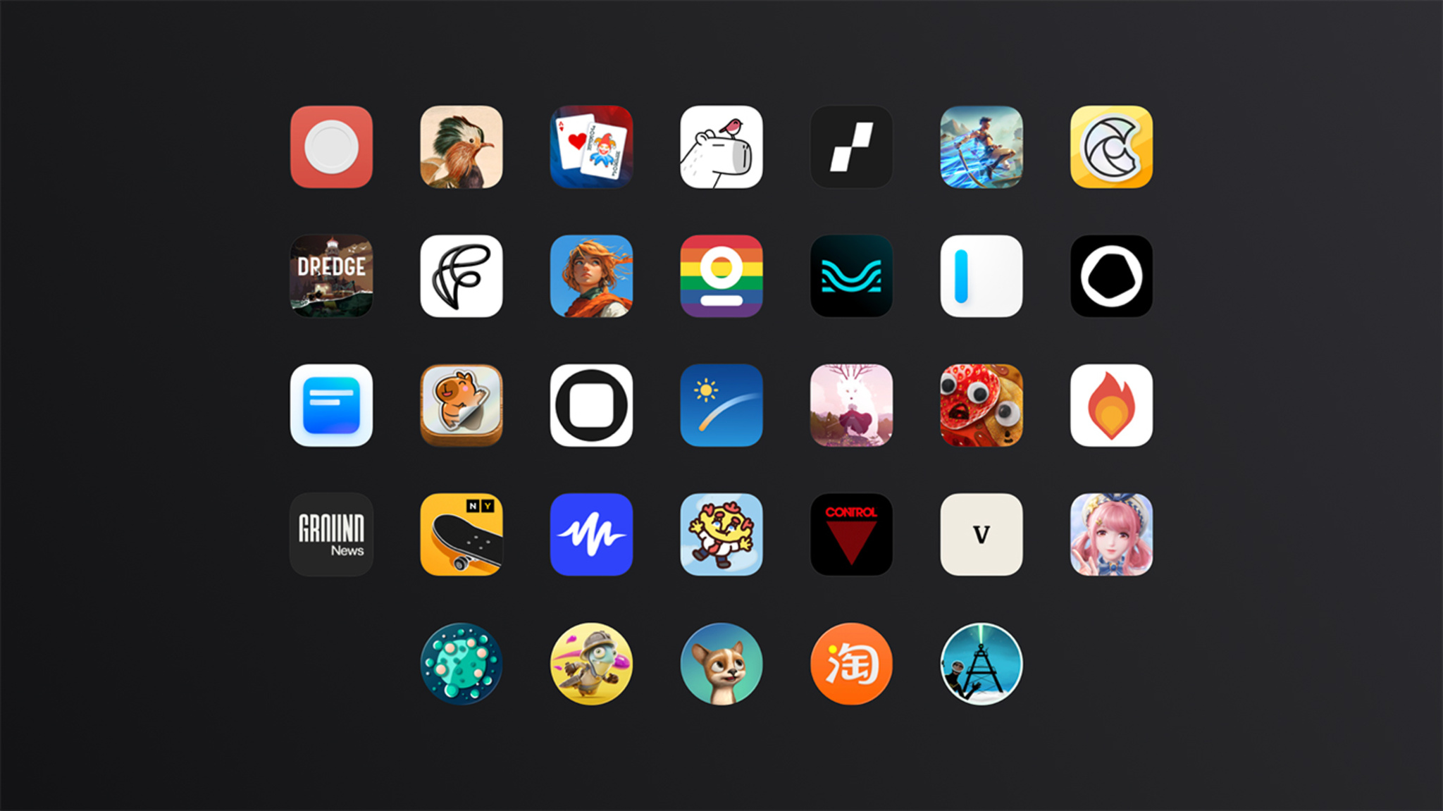
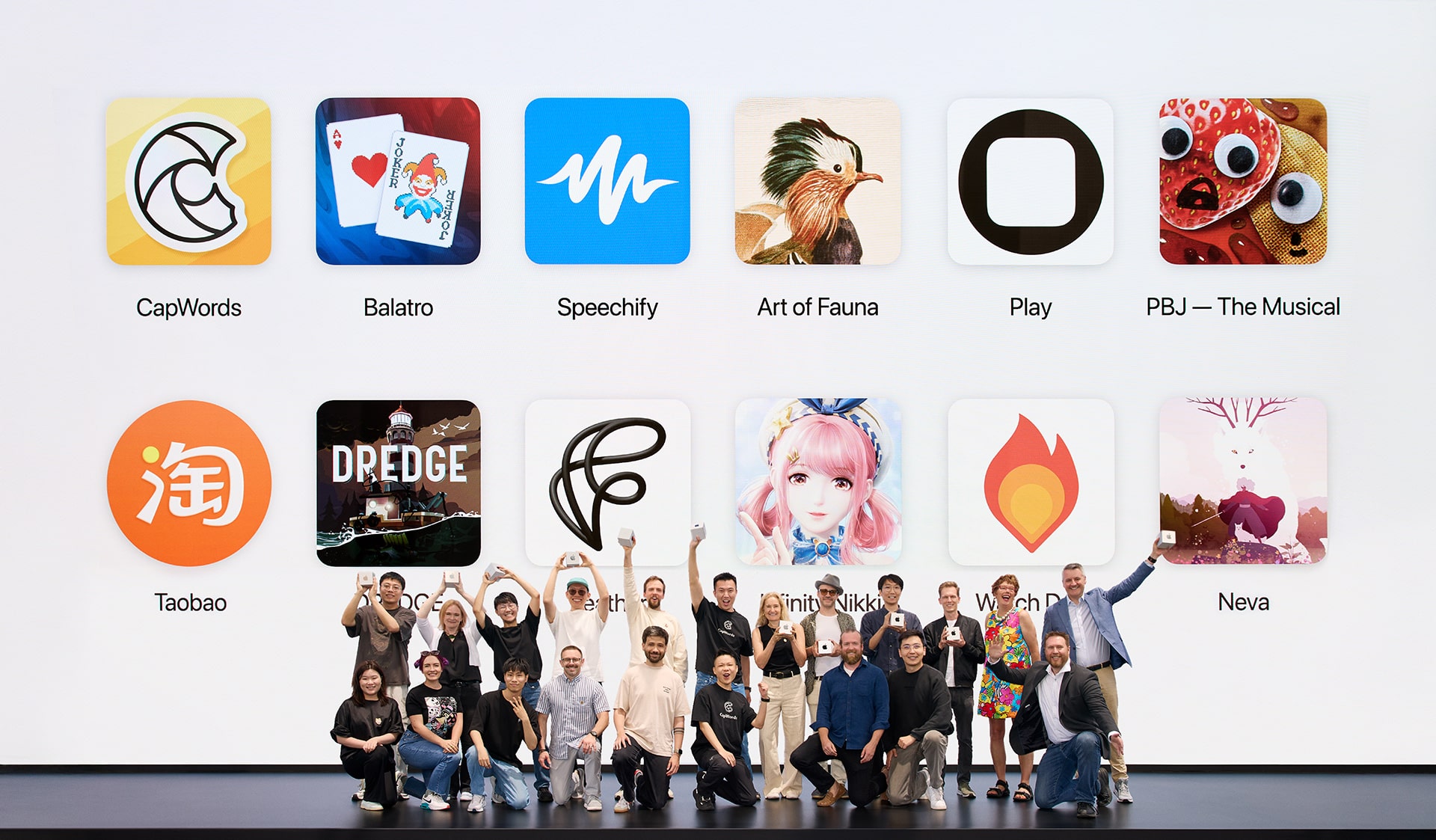
An artistic puzzler with a wildlife twist. A translation app powered by machine learning and stickers. And a card game that’s been on quite a run. Say hello to the wildly inventive crop of 2025 Apple Design Award honorees.
The Wreck is filed under games, but it’s also been called a visual novel, an interactive experience, and a playable movie. Florent Maurin is OK with all of it. “I like to think we’re humbly participating in expanding the idea of what a video game can be,” he says.
Maurin is the co-writer, designer, and producer of The Wreck — and here we’ll let you decide what to call it. The Wreck tells the tale of Junon, a writer who’s abruptly called to a hospital to make a life-changing decision involving her mother. The story is anchored by the accident that lends the game its name, but the ensuing narrative is splintered, and begins to take shape only as players navigate through seemingly disconnected scenes that can be viewed multiple times from different perspectives. The Wreck is far from light. But its powerful story and unorthodox mechanics combine for a unique experience.
“We tried to make a game that’s a bit off the beaten path,” says Maurin, who’s also the president and CEO of The Pixel Hunt studio, “and hopefully it connects with people.”
ADA FACT SHEET
Maurin is a former children’s journalist who worked at magazines and newspapers in his native France. After nearly 10 years in the field, he pivoted to video games, seeing them as a different way to share real stories about real people. “Reality is a source of inspiration in movies, novels, and comic books, but it’s almost completely absent in the gaming landscape,” he says. “We wanted to challenge that.”
Founded in 2014, The Pixel Hunt has released acclaimed titles like the App Store Award–winning historical adventure Inua and the text-message adventure Bury Me, My Love. It was near the end of the development process for the latter that Maurin and his daughter were involved in a serious car accident.
“It was honestly like a movie trope,” he says. “Time slowed down. Weird memories that had nothing to do with the moment flashed before my eyes. Later I read that the brain parses through old memories to find relevant knowledge for facing that kind of situation. It was so sudden and so intense, and I knew I wanted to make something of it. And what immediately came to mind was a game.”
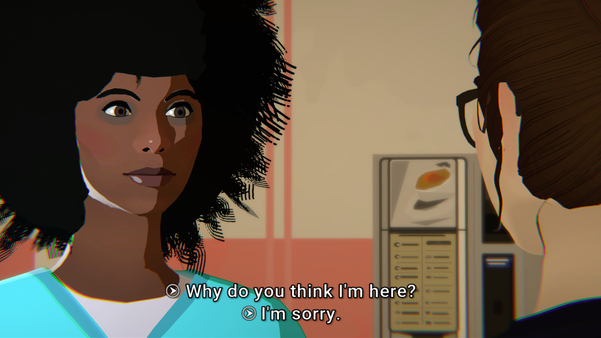
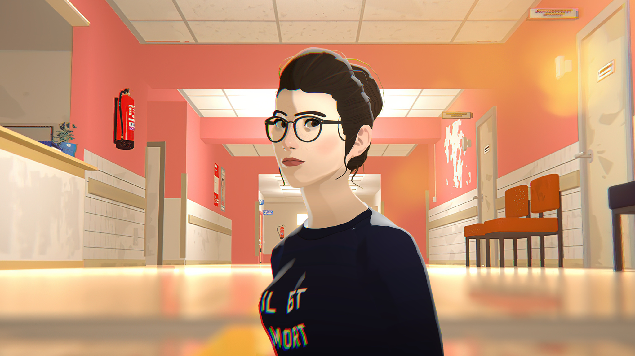
Junon’s interactions with the hospital staff drive the narrative in The Wreck.
But Maurin was too close to the source material; the accident had left a lasting impact, and he separated himself from the creative process. “I think I was trying to protect myself from the intensity of that feeling,” he says. “That’s when Alex, our art director, told me, ‘Look, this is your idea, and I don’t think it’ll bloom if you don’t really dig deep and own the creative direction.’ And he was right.”
That was art director Alexandre Grilletta, who helmed the development team alongside lead developer Horace Ribout, animator Peggy Lecouvey, sound designers Luis and Rafael Torres, and Maurin’s sister, Coralie, who served as a “second brain” during writing. (In a nice bit of serendipity, the game’s script was written in an open-source scripting language developed by Inkle, which used it for their own Apple Design Award-winning game, Overboard, in 2022.)
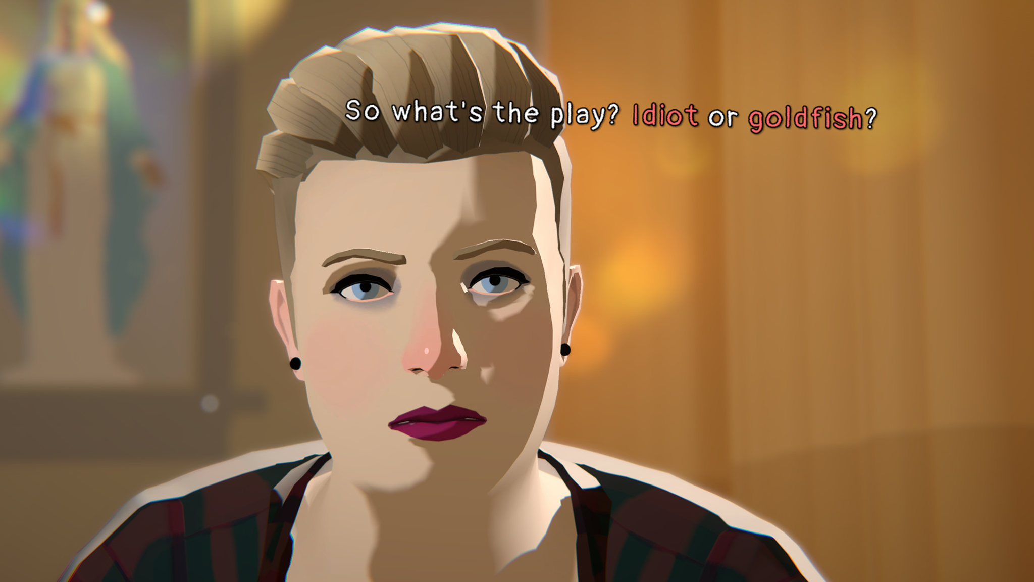
Junon’s sister might not be an entirely welcome presence in The Wreck.
The story of The Wreck is split into two parts. The first — what the team calls the “last day” — follows Junon at the hospital while she faces her mother’s situation as well as revealing interactions with her sister and ex-husband. Maurin says the “last day” was pretty straightforward from a design standpoint. “We knew we wanted a cinematic look,” he says, “so we made it look like a storyboard with some stop-motion animation and framing. It was really nothing too fancy. The part that was way more challenging was the memories.”
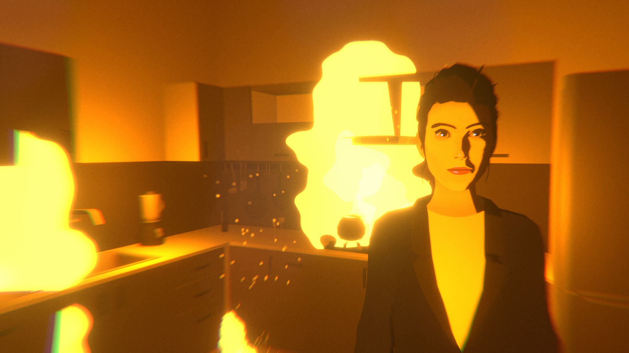
Those “memories” — and the backstory they tell — employ a clever mechanism in which players view a scene as a movie and have the ability to fast-forward or rewind the scene. These memory scenes feel much different; they’re dreamlike and inventive, with swooping camera angles, shifting perspectives, and words that float in the air. “I saw that first in What Remains of Edith Finch,” says Maurin. “I thought it was an elegant way of suggesting the thing that triggers a character’s brain in that moment.”
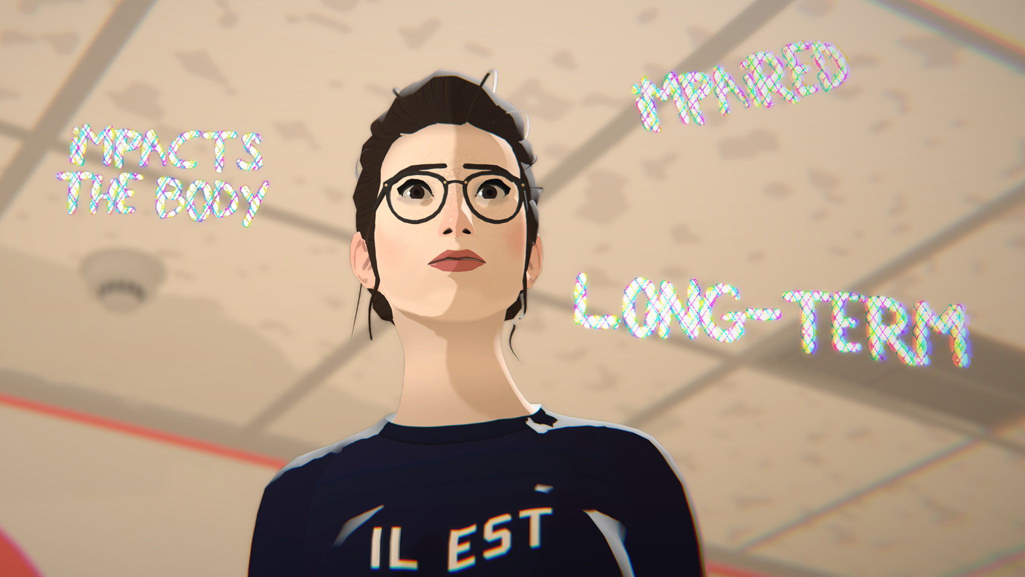
Junon’s thoughts are often conveyed in floating phrases that surround her in stressful moments.
Successive viewings of these memories can reveal new details or cast doubt on their legitimacy — something Maurin wrote from experience. “I’ll give you an example,” he says. “When my parents brought my baby sister home from the hospital, I remember the exact moment they arrived in the car. It’s incredibly vivid. But the weird part is: This memory is in the third person. I see myself tiptoeing to the window to watch them in the street — which is impossible! I rewrote my own memory for some reason, and only my brain knows why it works like that. But it feels so real.”
Throughout the development process, Maurin and team held close to the idea of a “moving and mature” story. In fact, early prototypes of The Wreck were more gamified — in one version, players grabbed floating items — but playtesters found the activity distracting. “It took them out of the story,” Maurin says. “It broke the immersion. And that was counterproductive to our goal.”
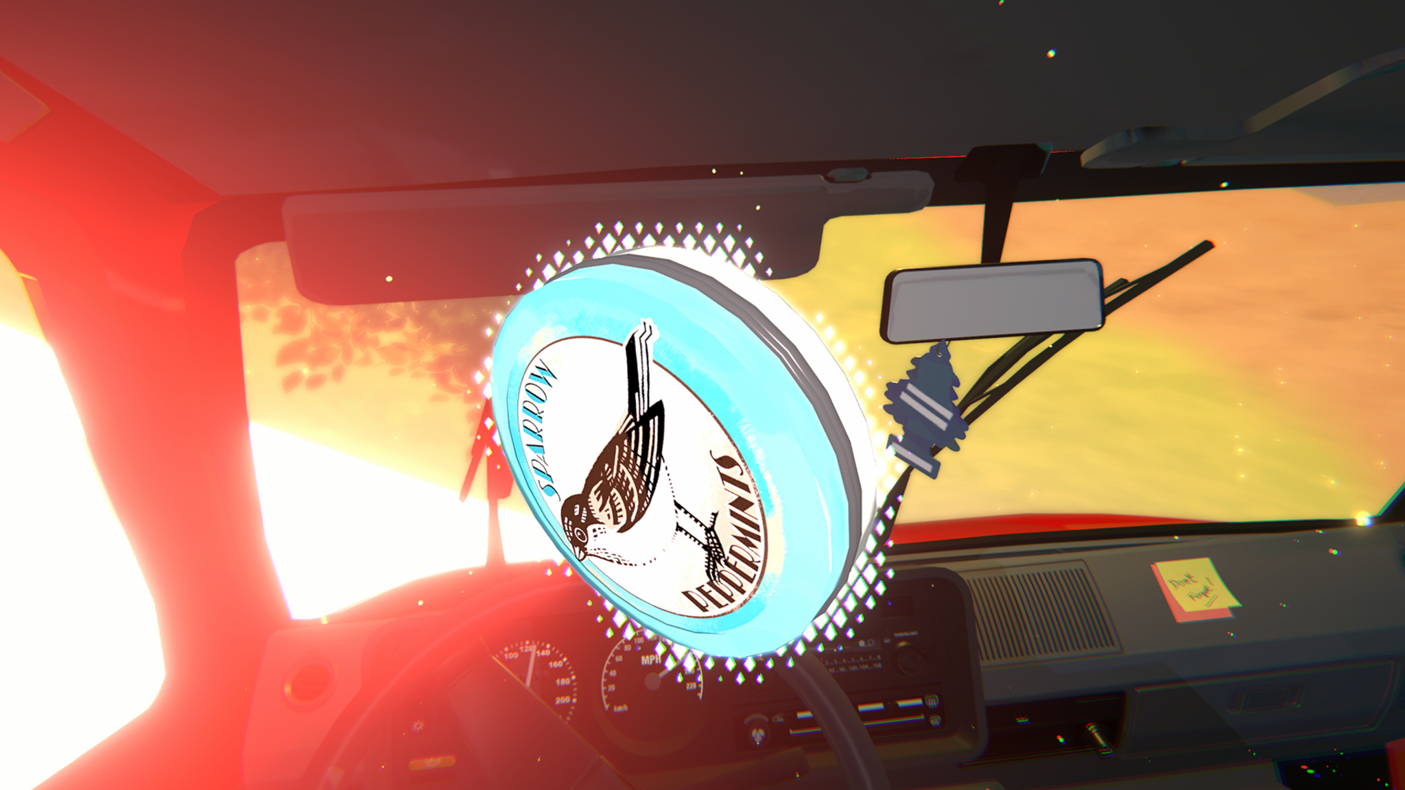
Items in The Wreck — like this tin of peppermints — often carry a larger meaning.
Maurin admits that approaching games with this mindset can be a challenge. “Some players are curious about our games and absolutely love them. Some people think, ‘These don’t fit the perception of what I think I enjoy.’ And maybe the games are for them, and maybe they’re not. But this is what we’ve been doing for 11 years. And I think we’re getting better at it.”
Meet the 2024 Apple Design Award winners
Behind the Design is a series that explores design practices and philosophies from finalists and winners of the Apple Design Awards. In each story, we go behind the screens with the developers and designers of these award-winning apps and games to discover how they brought their remarkable creations to life.
Ask Jason Toff whether his Apple Design Award winner is a game or an app, and his answer is yes.
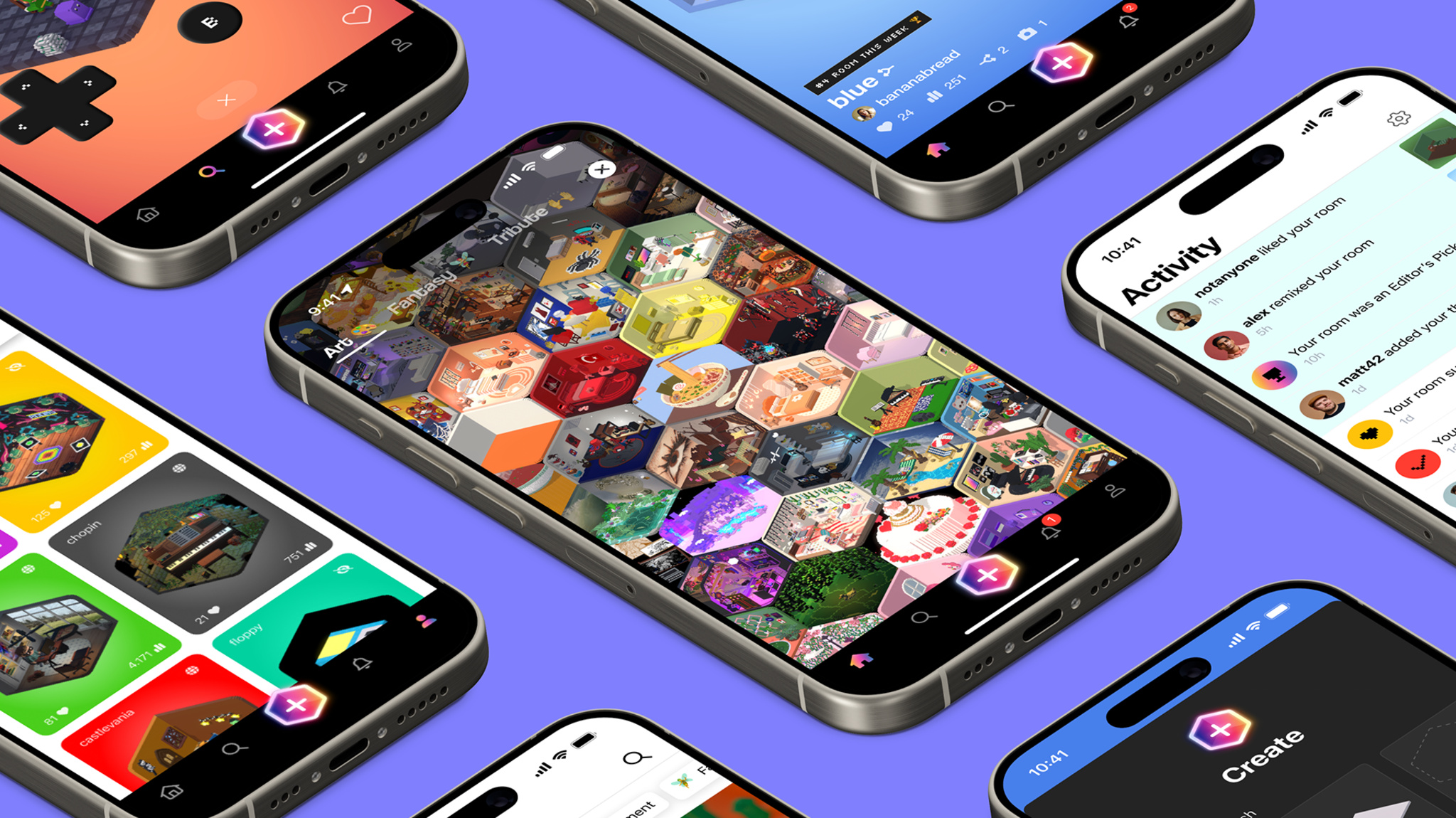
“There’s no one-sentence description for Rooms, and that can be a blessing,” laughs Toff, CEO and head designer of Things, Inc. “It’s not entirely a game, and it’s not entirely a tool. It’s more like a toy.”
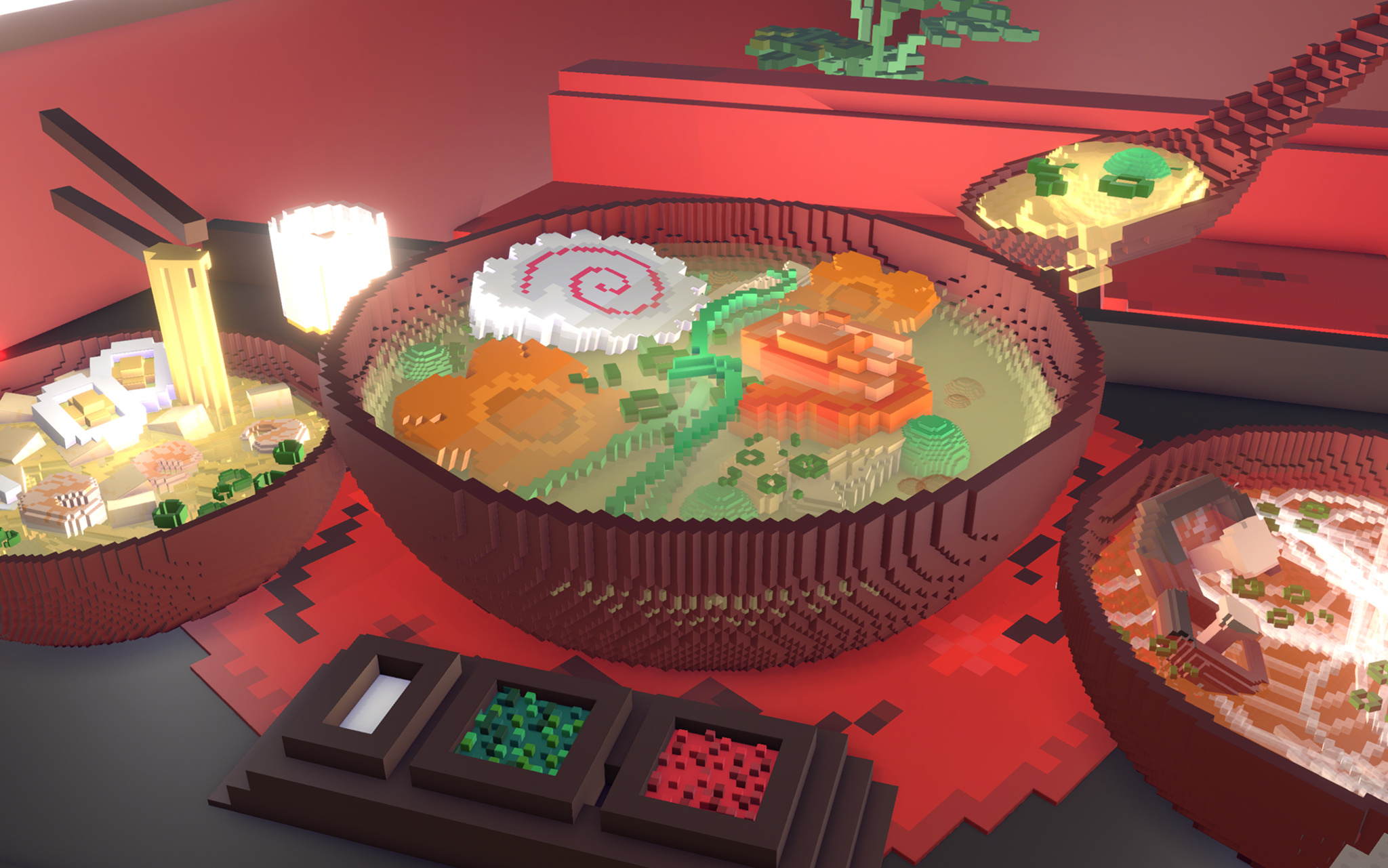
It’s also a blank canvas, cozy game, coding teacher, and social network — but we’re getting ahead of ourselves. At its heart, Rooms is a collection of user-generated 3-D spaces that feels like the open-ended world of the early internet. Start with an empty room or existing template, then fill it with an array of voxel decorations, items, pets, and avatars to create whatever space you like: a college apartment, medieval castle chamber, floating fantasy realm, pirate ship, or a Weezer concert (really), to name just a few. The only limits are the room’s boundaries — and Rooms fans have even gotten around those. “Our 404 page is a room with no walls,” Toff says, “so people just started copying it to work around the constraint.”
ADA FACT SHEET
Download Rooms from the App Store
In fact, that community element is a strong point: This creative tapestry of quirky games, tranquil havens, and clever ideas has been conjured by real people, which makes Rooms a social network as well. What’s more, users can click on each item to reveal its underlying code, offering them more options for customization.
To create Rooms — which, incidentally, won the ADA for Visuals and Graphics in games — Toff and cofounders Nick Kruge and Bruno Oliveira threw themselves back into their childhoods. “I was obsessed with Legos as a kid,” says Toff, not unexpectedly. “I found myself wondering, ‘What’s the digital equivalent of that?’”
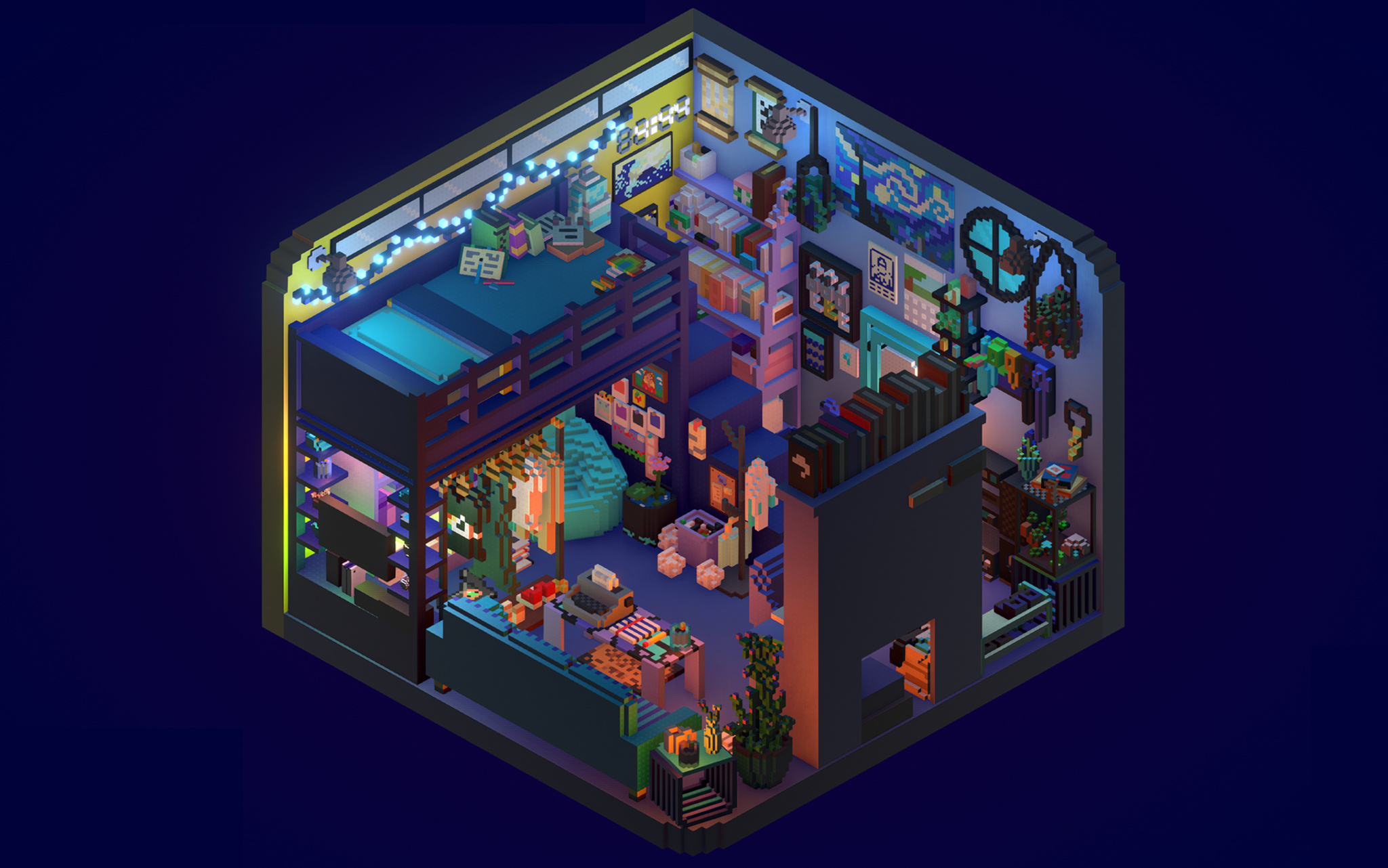
Rooms isn’t just about rooms; creators have plenty of ways to noodle on their ideas.
Drawing on that inspiration — as well as Toff’s experiences with Kid Pix on his dad’s 1989-era Mac — the Rooms team began envisioning something that, as Oliveira says, kept the floor low but the ceiling high. “We wanted anyone from 4-year-olds to their grandparents to be able to use Rooms,” he says, “and that meant making something free-form and creative.”
It also meant building something that gave a sense of approachability and creativity, which led them right to voxels. “Blocks have a charm, but they can also be kind of ugly,” Toff laughs. “Luckily, Bruno’s were cute and soft, so they felt approachable and familiar.” And from Oliveira’s side, blocks offered a practical value. “It’s much easier to do 3-D modeling with blocks,” says Oliveira. “You can just add or remove voxels whenever you want, which lowers the bar for everyone.”
We wanted anyone from 4-year-olds to their grandparents to be able to use Rooms, and that meant making something free-form and creative.
Jason Toff, CEO and head designer of Things, Inc.
Rooms launched in 2023 as a web-based app that included 1,000 voxel objects and allowed users to write their own code. It gained traction through both word of mouth and, more directly, a video that went viral in the cozy-gaming community. “All of a sudden, we had all these people coming,” says Oliveira, “and we realized we needed to prioritize the mobile app. Nick was like, ‘I think we can get feature parity with desktop on the iPhone screen,’ and we basically pulled a rabbit out of a hat.” Today, the vast majority of Rooms users are on mobile, where they spend the bulk of their time editing. “We were just shocked by how much time people were spending making rooms,” he says. “These weren’t quick five-minute projects. We did not anticipate that.”
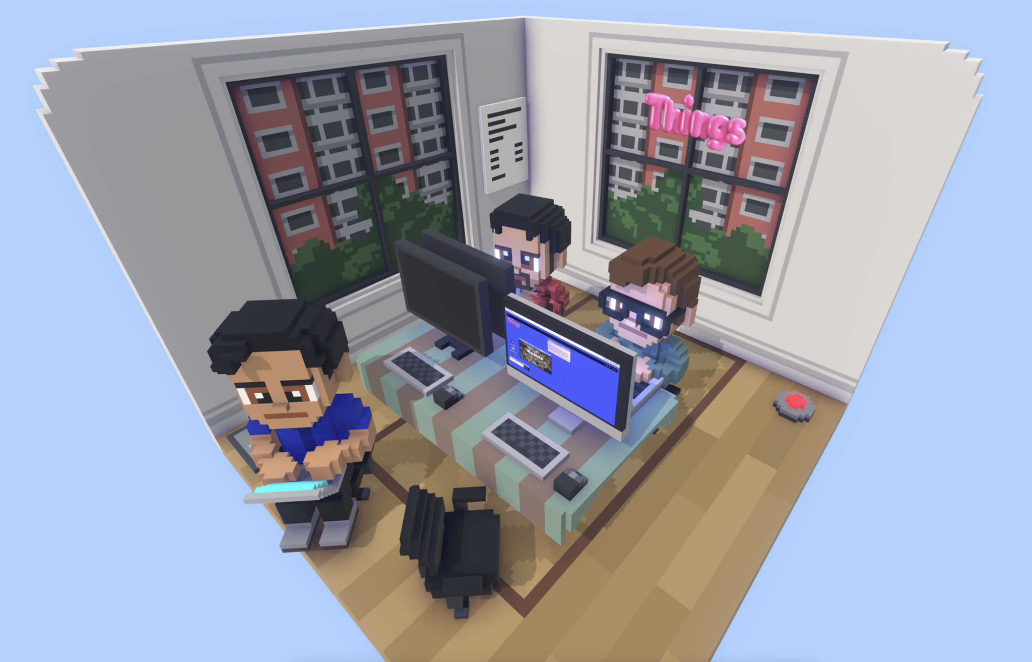
Of course the Things, Inc. team rebuilt their own offices in Rooms.
All that building fed into a social aspect as well. Toff says most of the items in Rooms are now created, edited, and amplified by lots of different users. “Here’s a good example: We have a sway effect that makes things wave back and forth a little,” he says. “Someone realized that if they put some branches on a tree and added that effect, the tree immediately looked alive. Now everyone’s doing that. There’s a real additive effect to building in Rooms.” Today, the Rooms library contains more than 10,000 items.
There’s a lot of power under the hood, too. “Rooms uses a Lua scripting language that runs in a C++ context,” says Oliveira, “so it’s kind of Lua, encased in C++, encased in Unity, encased in iOS.” Every room, he says, is a new Unity instance. And adding native iOS elements — like sliders on the Explore page and a bottom navigation — gives what he calls the “design chef’s kiss.”
An early sketch of Rooms shows how the room design came together early in the process.
Like its community, the Rooms team is used to moving fast. “One day I said, ‘It would be cool if this had a D-pad and A/B buttons,” says Toff, “and about 10 hours later Bruno was like, ‘Here you go.’” On another lark, Toff mentioned that it would be fun to let users fly around their rooms, and Kruge and Oliveira promptly created a “camera mode” that’s come to be known internally as the “Jason-Cam.”
That’s satisfying to a team that simply set out to build a cutting-edge plaything. “We always had this metaphor that Rooms was a swimming pool with a shallow side and a deep side,” says Oliveira. “It should be fun for people dabbling in the shallow side. But it should also be amazing for people swimming in the deep end. If you just want to look at rooms, you can. But you can also dive all the way down and write complicated code. There’s something for everyone.”
Meet the 2024 Apple Design Award winners
Behind the Design is a series that explores design practices and philosophies from finalists and winners of the Apple Design Awards. In each story, we go behind the screens with the developers and designers of these award-winning apps and games to discover how they brought their remarkable creations to life.
Join the worldwide developer community online for a week of technology and creativity.
Be there for the reveal of the latest Apple tools, frameworks, and features. Learn to elevate your apps and games through video sessions hosted by Apple engineers and designers. Engage with Apple experts in labs and connect with the worldwide developer community. All online and at no cost.
It’s an ice-cold late winter’s morning in Canada, but the offices of Ubisoft Quebec are ablaze with excitement.
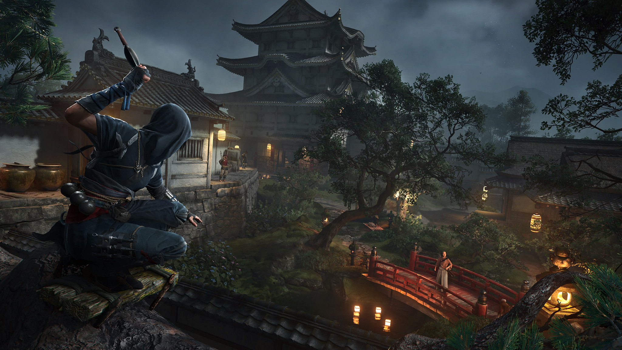
The Ubisoft team is preparing the release of Assassin’s Creed Shadows, the 14th main entry in the series and an evolution for the franchise in nearly every detail. It’s set in feudal 16th-century Japan, a rich and elegant period that’s been long sought-after by fans and Ubisoft team members alike. It introduces a pair of fierce protagonists: Yasuke, a powerful warrior of African origin, and Naoe, an agile Shinobi assassin, both brought to life with attention to historical accuracy. Its world feels alive with an ever-changing dynamism that’s apparent in everything from the shifting weather to the rotating seasons to the magical interplay of light and shadow.
And what’s more, it’s set to release on Mac the same day it arrives on PCs and consoles.
“It’s been a longtime dream to bring the game to Mac,” says Ubisoft executive producer Marc-Alexis Côté, who debuted the game on Mac during the WWDC24 Keynote. “It’s incredible that I can now open a MacBook Pro and get this level of immersion.” Shadows will also be coming later to iPad with M-series chips.
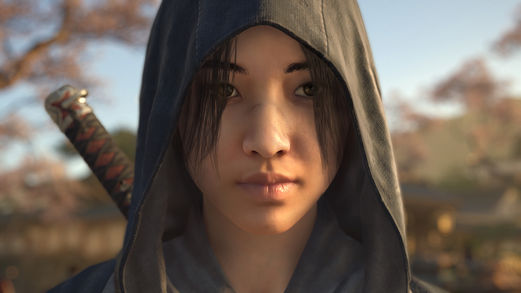
Naoe, one of the game’s two protagonists, is an agile assassin who’s at her best when striking from the shadows.
Today marks one of the first times that the gaming community will get its hands on Shadows, and to celebrate the occasion, the Ubisoft offices — a mix of cozy chalet-worthy reclaimed wood and wide-open windows that afford a view of snowy Quebec City rooftops — have been reskinned with an Assassin’s Creed theme, including a display that emphasizes the heft of Yasuke’s weapons, especially an imposing-looking 13-pound model of the character’s sword. (On this day, the display is hosted by associate game director Simon Lemay-Comtois, who appears quite capable of wielding it.)
Download Assassin’s Creed Shadows from the Mac App Store
Côté calls Shadows his team’s “most ambitious” game. In crafting the game’s expansive world, Ubisoft’s development team took advantage of an array of advanced Mac technologies: Metal 3 (working in concert with Ubisoft’s next-generation Anvil engine), Apple silicon, and a mix of HDR support and real-time ray tracing on Macs with M3 and M4 that Côté says was “transformative” in creating the game’s immersion.
It’s been a longtime dream to bring the game to Mac.
Marc-Alexis Côté, Ubisoft executive producer
“Seeing those millions of lines of code work natively on a Mac was a feeling that’s hard to describe,” Côté says. “When you look at the game’s performance, the curve Apple is on with successive improvements to the M-series chips year after year, and the way the game looks on an HDR screen, you’re like, ‘Is this real?’”
Assassin’s Creed Shadows is a balance of the technical and creative. For the former, associate technical director Mathieu Belanger says the capabilities of Mac laid the groundwork for technical success. “The architecture of the hardware is so well done, thanks in part to the unified memory between the GPU and CPU. That made us think the future is bright for gaming on the platform. So many things about doing this on Mac were great right out of the box.”

Naoe’s counterpart, Yasuke, prefers the use of brute force.
On the creative side, Ubisoft creative director Jonathan Dumont focused on a different opportunity. “The important thing was: Does this feel right? Is it what we want to send to players? And the answer was yes.”
The creative team’s goal was nothing short of “making this world feel alive,” says Martin Bedard, a 20-year Ubisoft veteran who served as the game’s technology director (and is very good at playing as Naoe). “You’re put into a moment that really existed,” he says. “This story is your playground.”
There are also fluffy kittens. We’ll get to those.
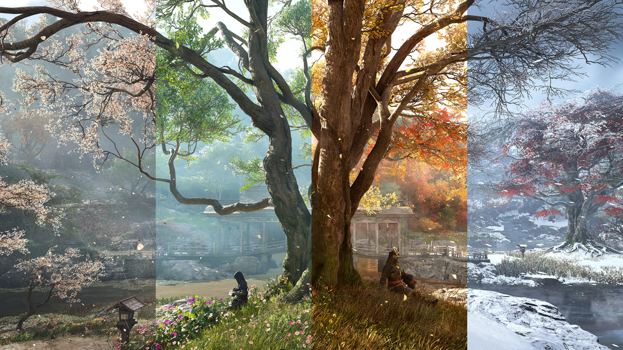
The ever-changing seasons lend an incredible variety to the game’s environments.
And there’s tremendous power behind the beauty, because the game’s biomes, seasons, weather, and lighting are all dynamic creations. The sunset hour bathes the mountains in soft purple light; the sun’s rays float in through leaves and temple roofs. Pretty much every room has a candle in it, which means the light is always changing. “Look at the clouds here,” says Bedard, pointing at the screen. “That’s not a rendering. These are all fluid-based cloud simulations.”
“Japan feels like it’s 80 percent trees and mountains,” says Dumont. “If you’re building this world without the rain, and the winds, and the mountains, it doesn’t feel right.”
Wherever you are, wherever you go, everything is beautiful and alive.
Mathieu Belanger, associate technical director
And those winds? “We developed a lot of features that were barely possible before, and one of them was a full simulation of the wind, not just an animation,” says Belanger. “We even built a humidity simulation that gathers clouds together.” For the in-game seasons, Ubisoft developed an engine that depicted houses, markets, and temples, in ever-changing conditions. “This was all done along the way over the past four years,” he says.
To pursue historical accuracy, Dumont and the creative team visited Japan to study every detail, including big-picture details (like town maps) to very specific ones (like the varnish that would have been applied to 16th-century wood). It wasn’t always a slam dunk, says Côté: In one visit, their Japanese hosts recommended a revision to the light splashing against the mountains. “We want to get all those little details right,” he says. (A “full-immersion version,” entirely in Japanese with English subtitles, is available.)
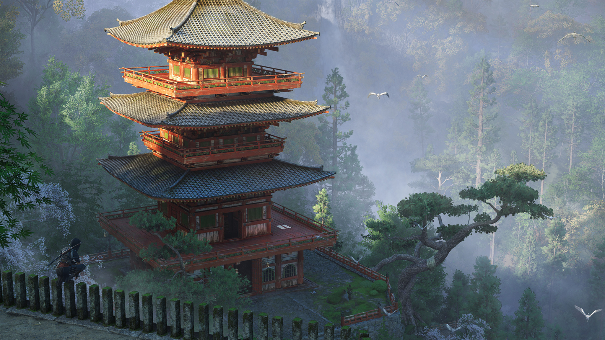
To recreate the world of 16th-century Japan, the Ubisoft creative visited Japan to study every detail.
Ubisoft’s decision to split the protagonist into two distinct characters with different identities, skill sets, origin stories, and class backgrounds came early in the process. (“That was a fun day,” laughs Belanger.) Ubisoft team members emphasize that choosing between Naoe and Yasuke is a matter of personal preference — lethal subtlety vs. brute force. Players can switch between characters at any time, and, as you might suspect, the pair grows stronger together as the story goes on. Much of Naoe’s advantage comes from her ability to linger in the game’s shadows — not just behind big buildings, but wherever the scene creates a space for her to hide. “The masterclass is clearing out a board without being spotted once,” says Bedard.
(The Hideout is) peaceful. You can say, ‘I feel like putting some trees down, seeing what I collected, upgrading my buildings, and petting the cats.’
Jonathan Dumont, Ubisoft creative director
Which brings us to the Hideout, Naoe and Yasuke’s home base and a bucolic rural village that acts as a zen-infused respite from the ferocity of battle. “It’s a place that welcomes you back,” says Dumont. It’s eminently customizable, both from a game-progression standpoint but also in terms of aesthetics. Where the battle scenes are a frenzy of bruising combat or stealth attacks, the Hideout is a refuge for supplies, artwork, found objects, and even a furry menagerie of cats, dogs, deer, and other calming influences. “There are progressions, of course,” says Dumont, “but it’s peaceful. You can say, ‘I feel like putting some trees down, seeing what I collected, upgrading my buildings, and petting the cats.”
“The kittens were a P1 feature,” laughs associate game director Dany St-Laurent.
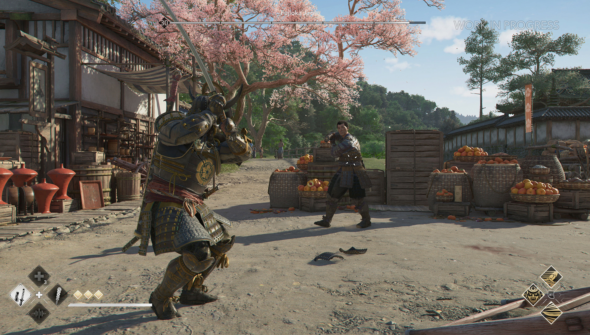
Yasuke prepares to face off against an opponent in what will likely be a fruitful battle.
Yet for all those big numbers, Dumont says the game boils down to something much simpler. “I just think the characters work super-well together,” he says. “It’s an open-world game, yes. But at its core, it features two characters you’ll like. And the game is really about following their journey, connecting with them, exploring their unique mysteries, and seeing how they flow together. And I think the way in which they join forces is one of the best moments in the franchise.”
And if the Ubisoft team has its way, there will be plenty more moments to come. “I think the game will scale for years to come on the Mac platform,” says Côté. “Games can be more and more immersive with each new hardware release. We’re trying to create something here where more people can come with day-one games on the Mac, because I think it’s a beautiful platform.”

As of today, apps without trader status have been removed from the App Store in the European Union (EU) until trader status is provided and verified by Apple.
Account Holders or Admins in the Apple Developer Program will need to enter this status in App Store Connect to comply with the Digital Services Act.

You can now take advantage of upgraded security options when creating new token authentication keys for the Apple Push Notification service (APNs).
Team-scoped keys enable you to restrict your token authentication keys to either development or production environments, providing an additional layer of security and ensuring that keys are used only in their intended environments.
Topic-specific keys provide more granular control by enabling you to associate each key with a specific bundle ID, allowing for more streamlined and organized key management. This is particularly beneficial for large organizations that manage multiple apps across different teams.
Your existing keys will continue to work for all push topics and environments. At this time, you don’t have to update your keys unless you want to take advantage of the new capabilities.
For detailed instructions on how to secure your communications with APNs, read Establishing a token-based connection to APNs.