12-07-2020, 07:01 PM
Poll: Box Art Brawl: Duel #70 – Super Ghouls ‘n Ghosts
<div><div class="media_block"><a href="https://images.nintendolife.com/ec3bef26f4f67/large.jpg"><img src="https://images.nintendolife.com/ec3bef26f4f67/small.jpg" class="media_thumbnail"></a></div>
<figure class="picture strip"><a title="Main" href="https://images.nintendolife.com/ec3bef26f4f67/main.original.jpg"><img loading="lazy" src="https://images.nintendolife.com/ec3bef26f4f67/main.900x.jpg" width="900" height="506" alt="Main"></a></figure>
<p>Welcome back to <a href="https://www.nintendolife.com/tags/box-art-brawl">Box Art Brawl</a>, our regular vote to see which box art variant from around the globe wins your approval.</p>
<p><a href="https://www.nintendolife.com/news/2020/11/poll_box_art_brawl_duel_69_-_the_legend_of_zelda_breath_of_the_wild">Last time</a>, we went all modern and looked at the two covers <strong><a href="https://www.nintendolife.com/games/nintendo-switch/legend_of_zelda_breath_of_the_wild">The Legend of Zelda: Breath of the Wild</a></strong> received. We thought it would be a much closer contest than it was, but the result is crystal clear: North American and Japan won by an absolute landslide with Europe getting less than 20% of your votes. Eye contact obviously isn’t all it’s cracked up to be. Congratulations to the East-meets-West pan-Pacific superpower!</p>
<p>This week we’re revisiting Capcom’s gruelling <strong><a href="https://www.nintendolife.com/games/nes/ghosts_n_goblins">Ghosts ‘n Goblins</a></strong> series with the 16-bit entry <strong><a href="https://www.nintendolife.com/games/snes/super_ghouls_n_ghosts">Super Ghouls ‘n Ghosts</a></strong>. It’s available for all <a href="https://www.nintendolife.com/guides/guide-nintendo-switch-online-every-nes-and-snes-game-available">Nintendo Switch Online subscribers</a> to play right now (it also features on the SNES Classic Mini) and the rewind feature will come in very handy with this rock-hard action platformer. North America triumphed in the three-way <a href="https://www.nintendolife.com/news/2020/02/poll_box_art_brawl_31_-_ghosts_n_goblins">Box Art Brawl #31</a> when the NES game went into battle against itself, but this time that territory is lumped in with Europe, too.</p>
<p>Armoured up? Let’s get slashin’.</p>
<h2>North America and Europe</h2>
<figure class="picture strip"><a title="NAEU" href="https://images.nintendolife.com/0df012b2dfc30/naeu.original.jpg"><img loading="lazy" class="lazy" src="//www.w3.org/2000/svg' viewBox='0 0 900 628'%3E%3C/svg%3E" width="900" height="628" data-original="https://images.nintendolife.com/0df012b2dfc30/naeu.900x.jpg" alt="NAEU"></a></figure>
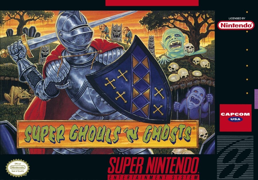
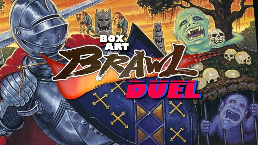
<p>While it sported a natty purple border in certain PAL countries, both regions featured the same key art and basic layout. The spooky landscape is littered — appropriately — with ghouls, ghosts and other unattractive nasties, and the gallant knight Arthur (presumably) stands front-and-centre with the logo running along the bottom.</p>
<p>It’s an odd mixture of styles. Arthur is realistically proportioned (relatively) while the background beasties appear with cartoon-y oversized heads. The gravestones are comically chunky. The font treatment of the title looks like it’s come straight from a ’90s TV commercial for farting goo in a tub. And the least said about perspective of poor Arthur’s right arm, the better. Looks painful.</p>
<p>Yes, it’s a weird hodgepodge. But for some reason… <em>we kinda like it.</em></p>
<h2>Japan<br /></h2>
<figure class="picture strip"><a title="JP" href="https://images.nintendolife.com/c3650d7898f6e/jp.original.jpg"><img loading="lazy" class="lazy" src="//www.w3.org/2000/svg' viewBox='0 0 900 1661'%3E%3C/svg%3E" width="900" height="1661" data-original="https://images.nintendolife.com/c3650d7898f6e/jp.900x.jpg" alt="JP"></a></figure>
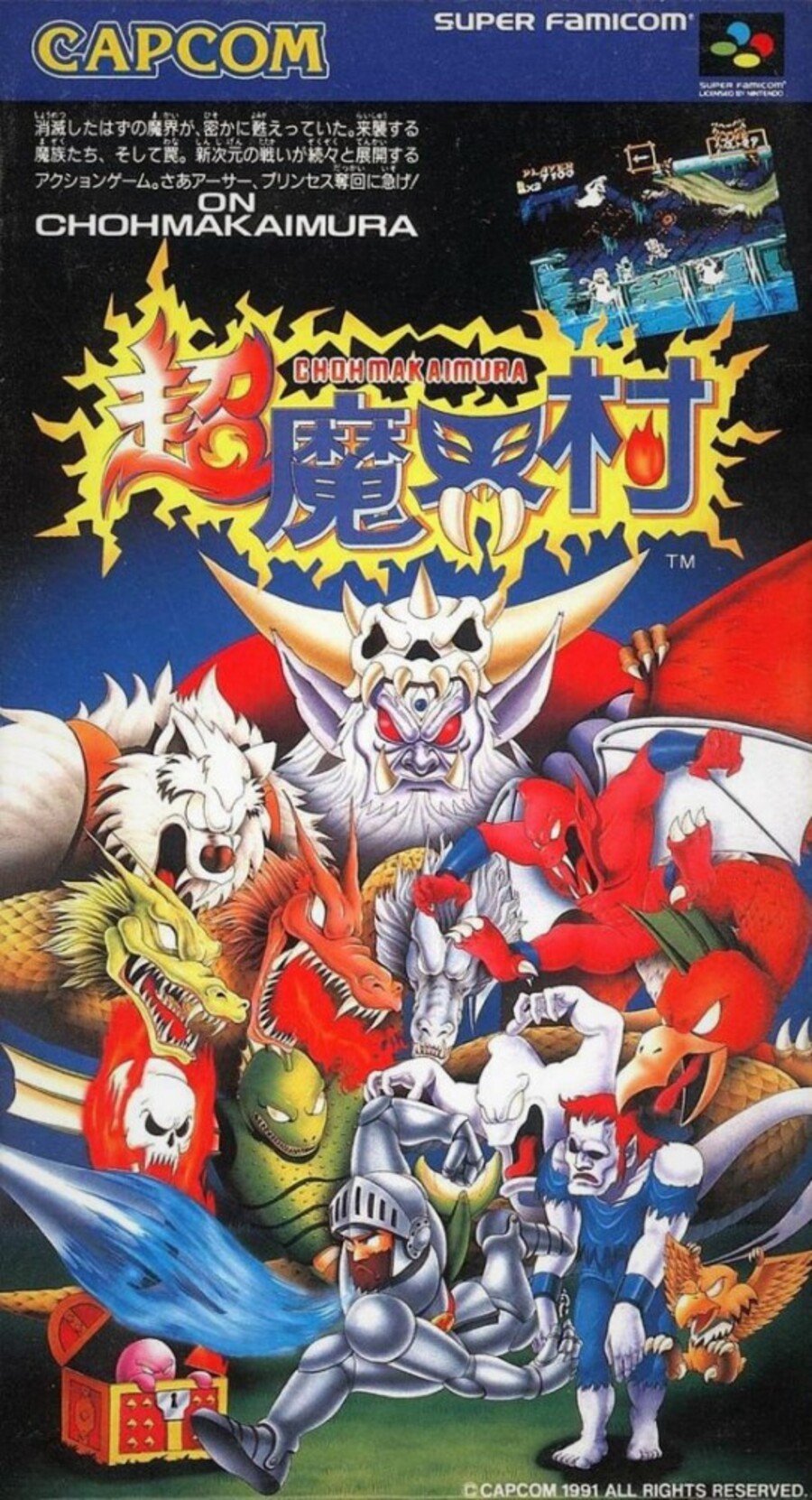
<p>The cover of <strong>Chomakaimura</strong>, as the game is known in Japan, features a more familiar-looking Arthur at the very bottom with a host of enemies bearing down from above.</p>
<p>Compared to the western variant, the art style here feels more consistent across the box, and the colours certainly pop. It’s a little tough to parse that crowd of monsters and it’s easy to miss the screenshot occupying the upper righthand corner. We like the idea of showcasing the game’s graphics on the cover and the fact that the screen is at an angle — almost as if it’s <em>another</em> enemy looking down on Arthur — but it makes a busy cover even busier.</p>
<p>Killer logo, though. Puts the western version to shame.</p>
<h2>Bonus!</h2>
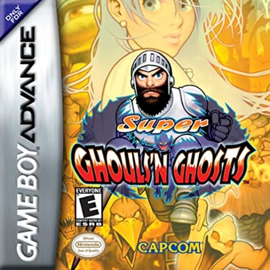
<p>And just for funsies (it won’t be featured in the poll), here’s the more straightforward cover of the GBA remake:</p>
<figure class="picture strip"><a title="GBA" href="https://images.nintendolife.com/6a69765508695/gba.original.jpg"><img loading="lazy" class="lazy" src="//www.w3.org/2000/svg' viewBox='0 0 900 900'%3E%3C/svg%3E" width="900" height="900" data-original="https://images.nintendolife.com/6a69765508695/gba.900x.jpg" alt="GBA"></a></figure>
<hr>
<p>So, you’ve seen both covers, but which is best? Pick your favourite and hit ‘Vote’ to let us know below:</p>
<p><em>Take care beautiful people, and we’ll see you next time for another round.</em></p>
</div>
https://www.sickgaming.net/blog/2020/12/...-n-ghosts/