Welcome to Box Art Brawl, the battle between box art variants from around the globe scrapping to win your vote.
Last time we lost our collective minds in the company of Eternal Darkness: Sanity’s Requiem, although we regained our composure enough to see the metaphysical North American and European version win with nearly two-thirds of your vote to one.
This week we’re a day earlier than usual just so we can squeeze in one final spooky brawl before November arrives. Resident Evil 0 launched on GameCube on November 12th 2002, very almost twenty years ago. It was subsequently re-released on Wii and most recently in remastered form on modern consoles, including Switch.
That launch date meant that the game just missed Halloween and, more disappointingly, this dual-protagonist prequel failed to strike a chord with most RE fans. However, we rather enjoyed revisiting it with the remaster. No, it’s not the best RE by a long shot, but as one of a finite number of old-school games in the series, it provides plenty of the clunky-yet-effective survival horror thrills.
So, grab your partner, keep your inventories strictly separate, and let’s board the fright train…
Japan
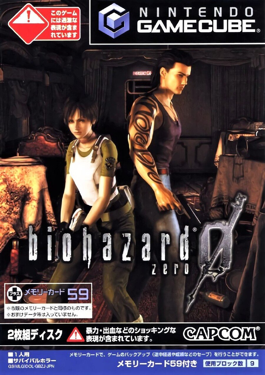
The Japanese cover puts Rebecca and Billy back-to-back in the middle of one of the train carriages from the start of the game, although it’s not immediately obvious they’re on a locomotive if you haven’t played the game. Billy’s tribal tats show that he’s a bad boy, though probably one with a heart of gold, and Rebecca’s S.T.A.R.S. shoulder badge will mean something to fans examining the cover.
The perspective is a little odd, and it’s difficult to know if Rebecca’s tiny or Billy’s a giant, but the Biohazard logo is as cool as ever. Not bad, overall.
Europe
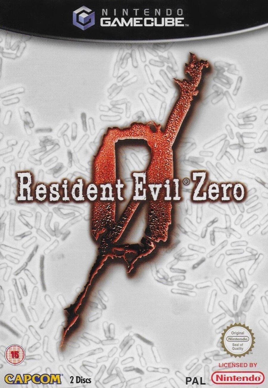
The European cover uses the classic typewriter font and the big red ‘0’ logo over a white background showing a virus under a microscope. Which virus is it, you ask? Oh, just pick a letter — it’s one of those.
Not much else to say, really. It’s simultaneously striking and understated, but it doesn’t really capture the imagination.
North America
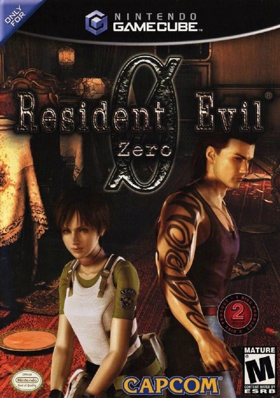
And finally, the North American variant uses the same key art as the Japanese box, but reframed with the logo centred at the top. In our opinion, the big ‘0’ behind the logo font loses something as a typed character rather than a stylised scrawl, and the dark logo over a dark drop shadow against the murky train carriage background means the name of the game gets a bit lost.
It’s a toughie this week, that’s for sure.
So, you’ve seen the three options, but which is best? Pick your favourite and hit ‘Vote’ to let us know:
Enjoy Halloween, everyone! Stay safe, and we’ll see you next time for another Box Art Brawl.
https://www.sickgaming.net/blog/2020/10/...nt-evil-0/


