

02-22-2020, 06:42 PM
Hello everyone. Haven't posted here yet so figured i would now.
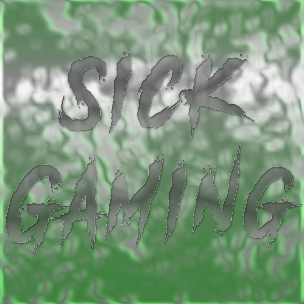
Here are some designs I made up:

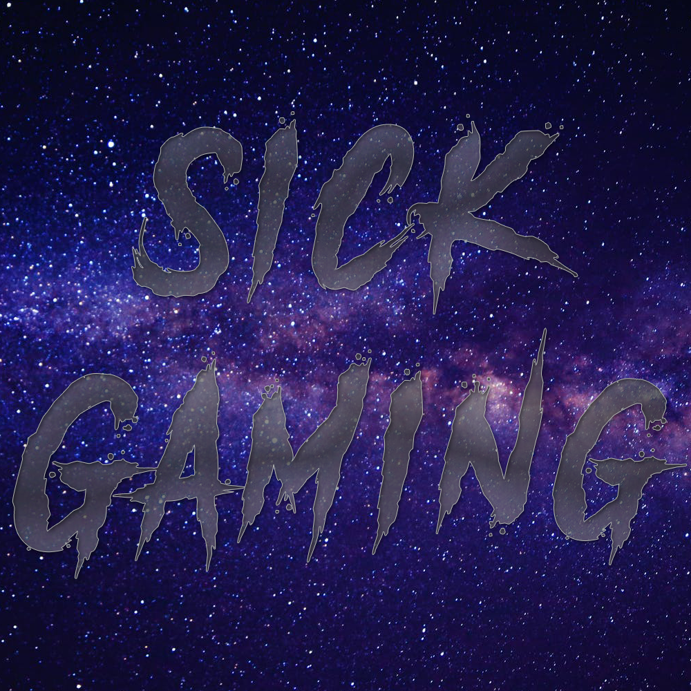
Avatar Sick Gaming Galaxy Rocket League Version
[spoiler]

[/spoiler]
Sick Prodigy Galaxy Avatar
[spoiler]

[/spoiler]
Sick Gaming Galaxy Avatar
[spoiler]

[/spoiler]
Sick Gaming OG Carbon Lined Gold Tipped
[spoiler]

[/spoiler]
Sick Gaming Fire Lava
[spoiler]

[/spoiler]
WeStill5Am Word Art
[spoiler]

[/spoiler]
Here are some designs I made up:
Avatar Sick Gaming Galaxy Rocket League Version
[spoiler]
[/spoiler]
Sick Prodigy Galaxy Avatar
[spoiler]
[/spoiler]
Sick Gaming Galaxy Avatar
[spoiler]
[/spoiler]
Sick Gaming OG Carbon Lined Gold Tipped
[spoiler]
[/spoiler]
Sick Gaming Fire Lava
[spoiler]
[/spoiler]
WeStill5Am Word Art
[spoiler]
[/spoiler]