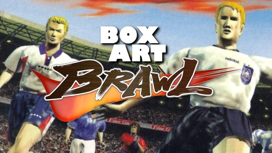
Welcome back to Box Art Brawl, the series where we throw a rosette and a bunch of regional box art variants into a pit and see which one emerges victorious with the bloodied prize pinned to its chest.
Last week we watched as Mario Bros. battled for your amusement and pleasure. In a shocking turn of events, the sneaky reissued European version triumphed over the classic North American box which left the Famicom port of the arcade game in third place. We honestly thought the pixel art cover had that one wrapped up, but it wasn’t to be. A valiant attempt, but thwarted.
This week we’re jumping two generations forward to the Nintendo 64 and one of the best digital interpretations of the beautiful game ever made with Konami’s ISS 64. This game is a particular favourite at the Nintendo Life office that we fire up on a regular basis not only for its silky gameplay, but also for the exquisite delivery of its excitable commentator. The commentary jumps hilariously from calm to INCREDIBLY ANIMATED at the drop of a hat – usually mid-sentence – as the lines are hastily wedged in between your play. Team names are a particular highlight, especially when “GREECE!” or “BRAZIL!” are on the pitch. It’s priceless and we wouldn’t have it any other way.
Enough of this banter, let’s kick things off.
“Welcome to this live broadcast. This is glorious football weather.”
Europe

“First half kicks off…”
Forgoing the usual black border of the European PAL boxes, ISS 64 starts strong with a mixed international team on the cover. The logo has an old-school Sky Sports feel to it with plenty of colour and impact. The image itself is dynamic and really puts you on the field, seemingly in the boots of the goalkeeper as this bunch of bleeding-edge renders drive play towards you.
Throw in a packed stadium and this team has the makings of a great one. The red ‘KONAMI’ on the left gets a bit lost, but Europe has come out fighting with this effort.
“YES! Wonderful cover! Will he take a shot? He’s hit it first TIME!!!”
Japan

“Consummate skill, there!”
Heading to Japan, here we have the original Jikkyou J.League Perfect Striker, the game released in December 1996 and formed the basis for the ISS 64 we know and love before it was adapted for the west. Now, it should be noted that ISS 64 went back to Japan in the form of Jikkyou World Soccer 3 which released two months after the western version in September 1997, with international teams replacing the original’s Japanese League teams.
So, in a very real sense Japan has two versions of ISS 64, the lucky so-and-sos . We’ve chosen to go with the original Perfect Striker because 1) the players from this officially-licensed J.League cover were simply re-skinned for the European release, so that sets up a nice parallel, and 2) we find the faces of the players on the Jikkyou World Soccer 3 cover even more unnerving than these automatons. Please feel free to register any complaints or concerns about editorial bias sullying the integrity of this hallowed video game box contest in the comments. They shall be diligently filed with the ones from last week.
“THE REFEREE SAYS PLAY ON!”
Once again we get players from different teams together on the pitch, although the dark night sky here was traded for blue in the west and while the black helps contrast against the logo, a floodlight or a few stars might have livened things up. Despite sitting on a dark background, the title still gets a little lost. The ‘KONAMI’ is white this time and punches out a bit more, though. Overall, it’s another decent effort, but has it done enough to see off the competition?
“This COULD be a chance! He’s looking around for openings…”
North America

“It sails to the… Right.”
Ah! The North American cover is nothing if not succinct and to-the-point. It’s got a soccer ball on it and you’re not going to miss the title on this one. You get the standard red strip down the right side of the cover and the peeled-back corner with the ‘Only For Nintendo 64’ logo. It’s easy to overlook, but this one does in fact feature a player as part of the Nintendo Sports logo in the top left corner.
Not much else to say, really. It’s not our favourite, but we’re not the ones voting, are we?
“WHAT A HOWLER!”
“He has players waiting for the cross! He centres the high ball. WHAT AN OPPORTUNITY!”
So, three different covers for one of the best football games ever, but which one gets your vote? Click your pick below and hit the ‘Vote’ button:
“Let’s see that again…”
“And there it is! Full time has been blown! A stunning victory for…” We’ll catch you next week for Box Art Brawl #30.
https://www.sickgaming.net/blog/2020/02/...soccer-64/


